WebDesign Tutorial - UI / UX tips & tricks (part 2)
Material Minimal - Design less, impact more

This is part 26. You can find the part 25, UI / UX tips & tricks (part 1), here.
UI / UX tips & tricks (part 2)
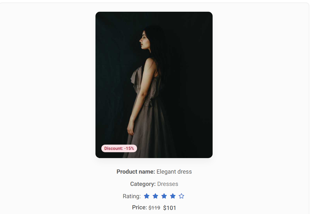
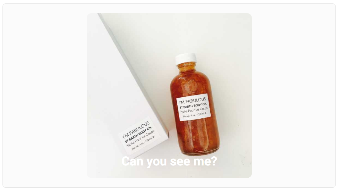
Don't treat the user like an idiot: DON'T :(
Sometimes labels not only do not bring any benefit, but they can give the impression that we treat the user like an idiot.
Does the user really need additional support to understand that:
"Elegant dress" is the name of the product?
"-15%" means a discount?
"Dresses" means a category?
Stars mean rating?
"$101" is the price?
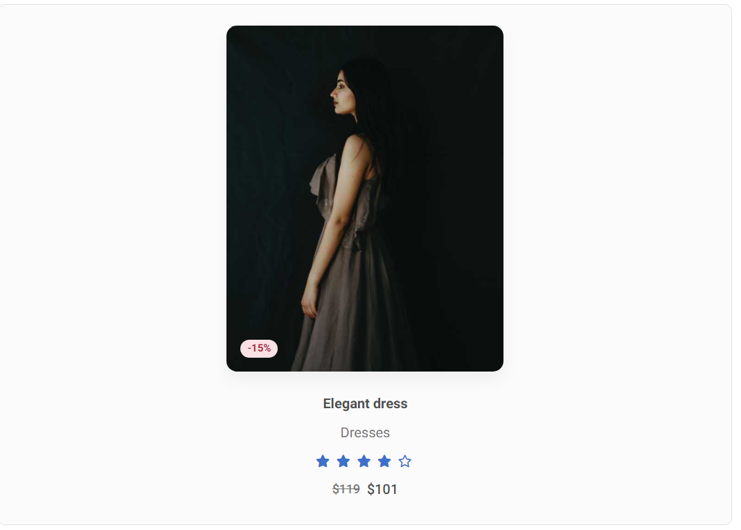
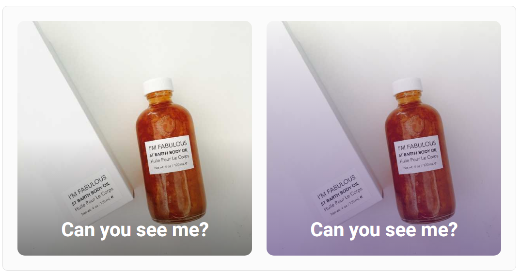
Don't treat the user like an idiot: DO :)
Of course, he doesn't. So let's take him seriously in our UI and avoid unnecessary labels.
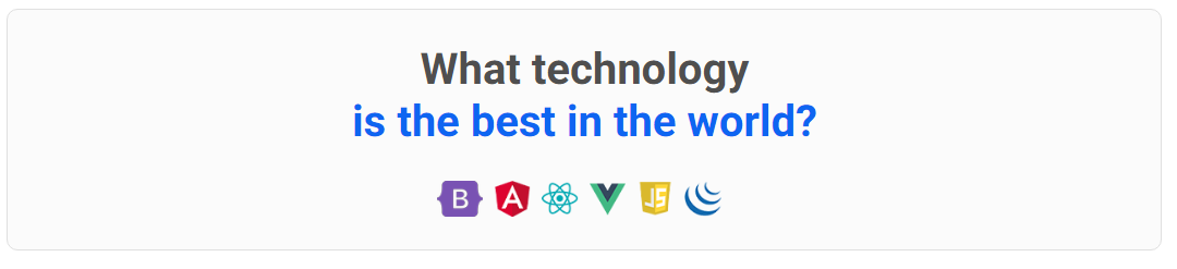
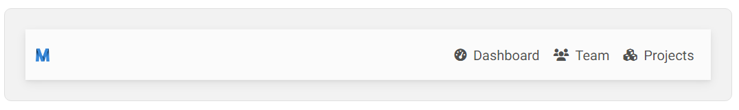
Contrast for visibility: DON'T :(
Avoid situations where important interface elements blend together instead of standing out (like the logos in the example below).
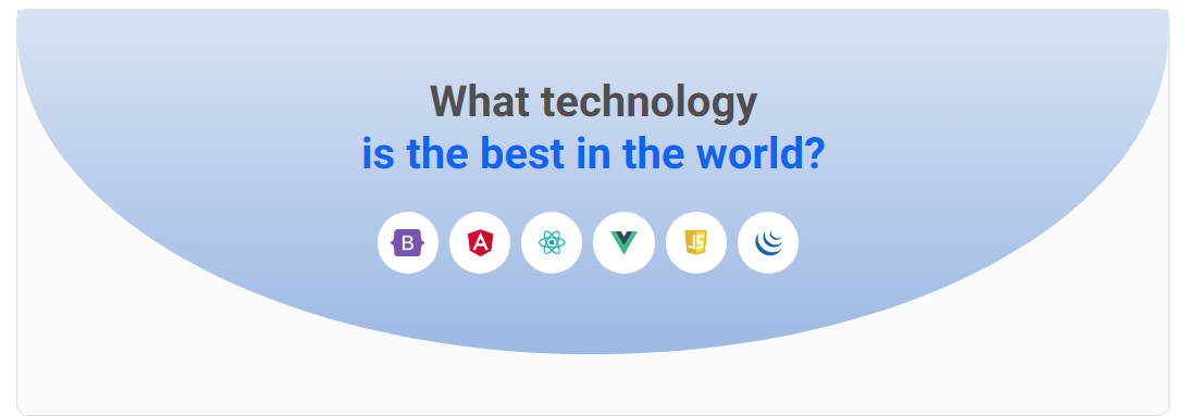
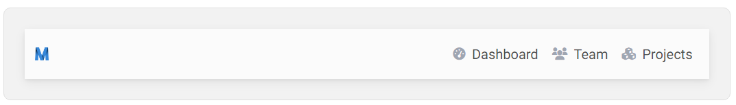
Contrast for visibility: DO :)
If you want to highlight an element, give it a background that contrasts with its surroundings. In the example below, we added a gradient blue background to the section, and put the logos in white circles.
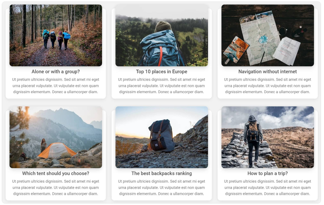
White space is low-hanging fruit: DON'T :(
An overloaded listing with articles can take away the desire to read.
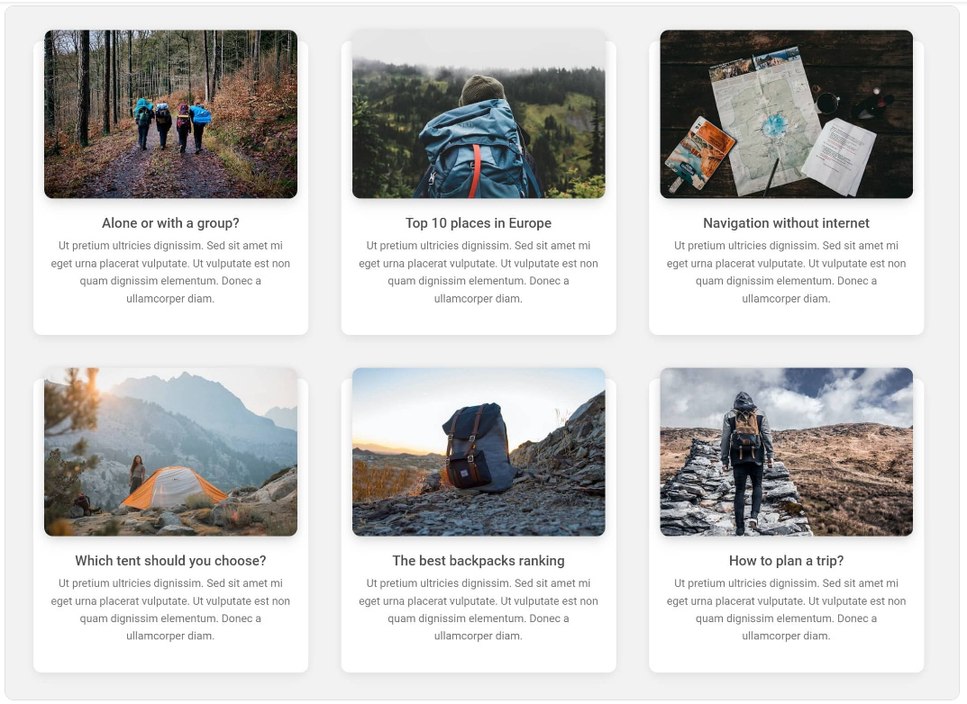
White space is low-hanging fruit: DO :)
Adding white space is the easiest and quickest way to enhance the aesthetics. Why not take advantage of it?
Reduce contrast in decorative elements: DON'T :(
If you want to use decorative elements, such as icons, try to keep them from competing for attention with more important elements, like for example links.
Reduce contrast in decorative elements: DO :)
You can lower the visibility of decorative elements by reducing the contrast between them and their surroundings. In this case, you can make the icons brighter and more blend in with the white background.
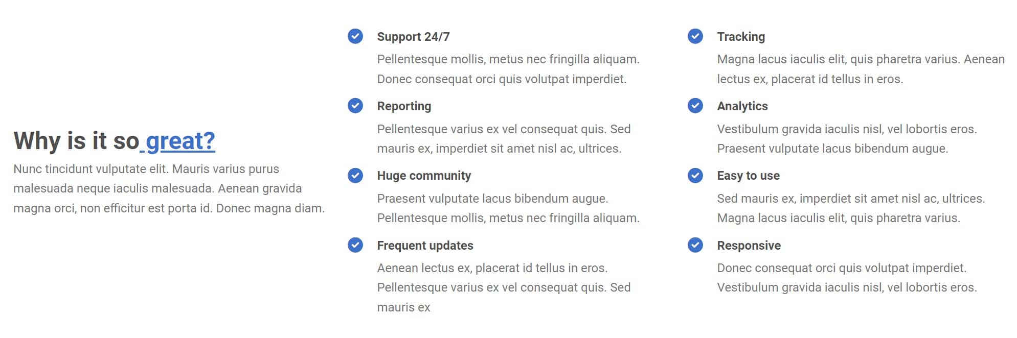
Let it breathe: DON'T :(
Don't pack your list of features too densely. Such a mass of text makes the user instinctively and disgustedly skip the entire section.
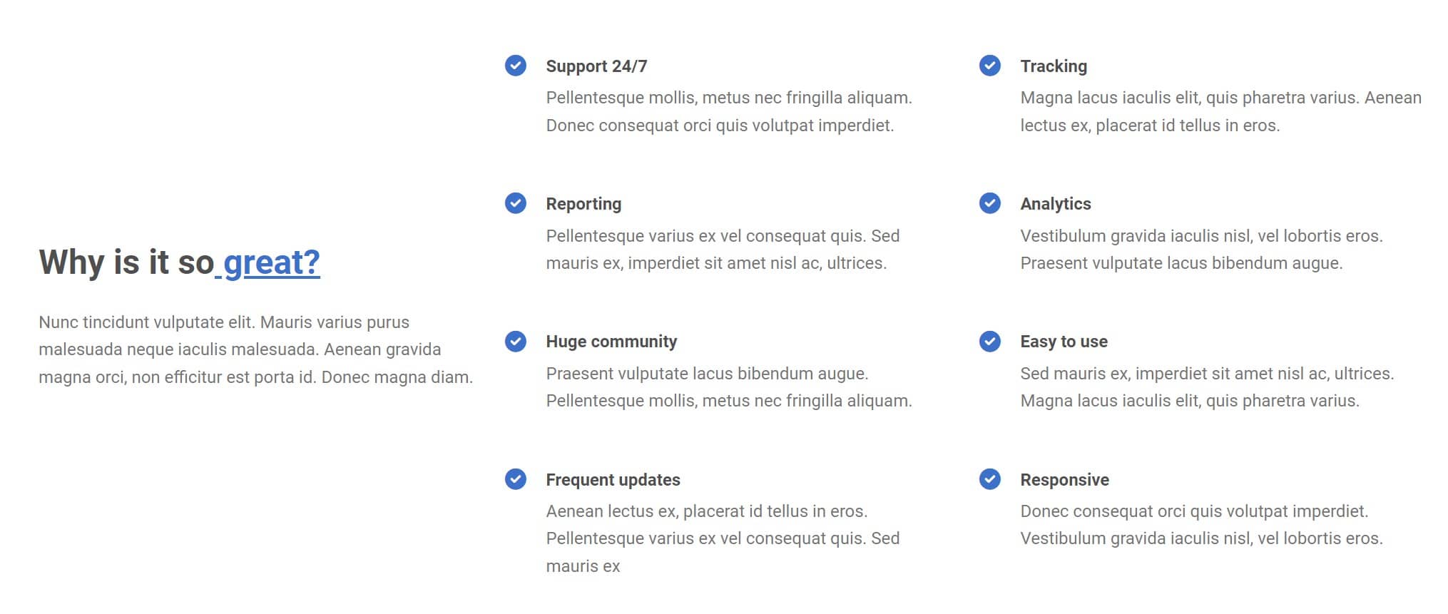
Let it breathe: DO :)
Use the magic of white space and add some slack to your design.
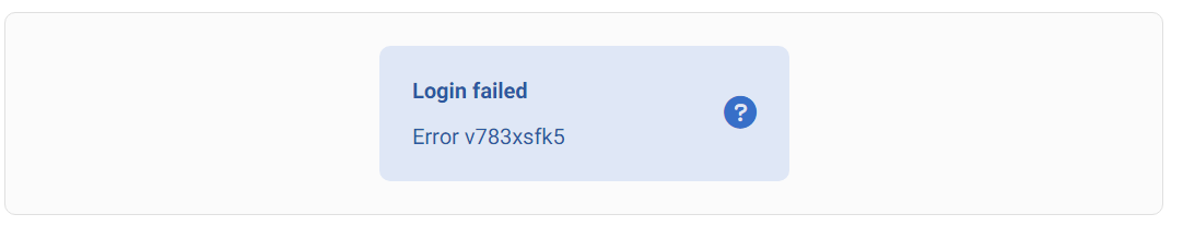
Avoid unclear messages: DON'T :(
Remember that you are creating an interface for users, not for yourself or other developers. Avoid unclear messages and ambiguous colours or icons.
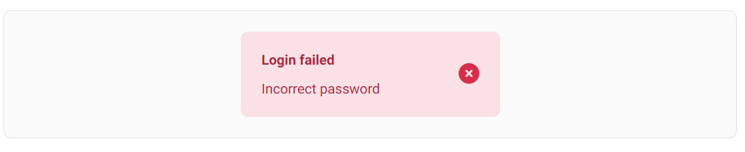
Avoid unclear messages: DO :)
Playing with contrast and weight at the same time: DON'T :(
Sometimes reducing the contrast alone is not enough, as it can reduce the visibility of an element too much, such as the dividing lines in the cards below.
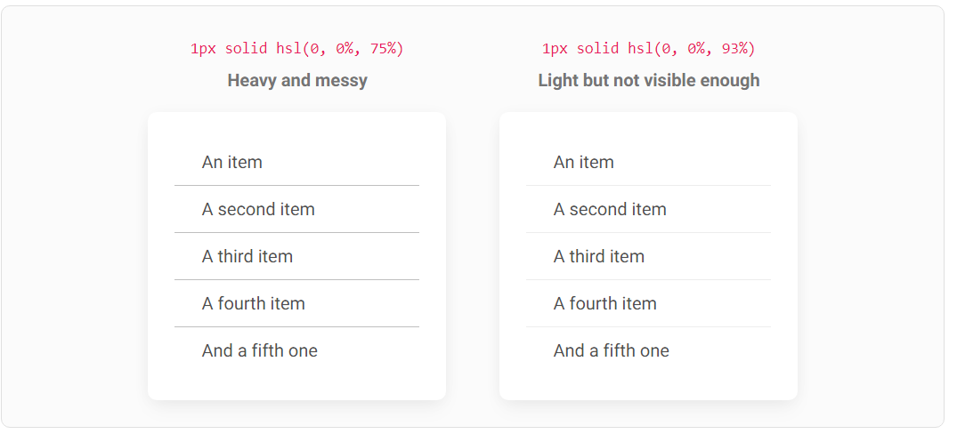
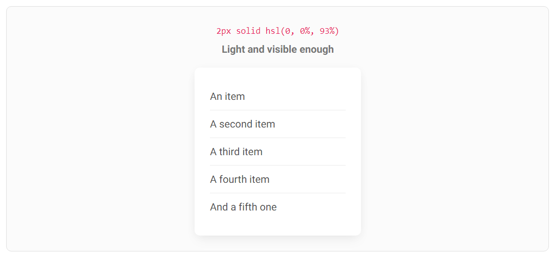
Playing with contrast and weight at the same time: DO :)
But you can combine 2 things - use a lighter color to reduce the contrast, while increasing the weight of the dividers by changing their thickness from 1 pixel to 2 pixels.
This will compensate for the colour change, so we can enjoy the lower contrast of the secondary element without losing its usability.
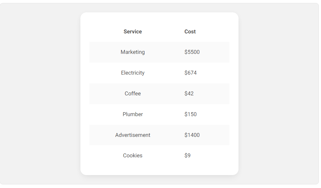
Content alignment in tables: DON'T :(
Avoid centring content in the table and aligning numbers to the left. This significantly reduces readability.
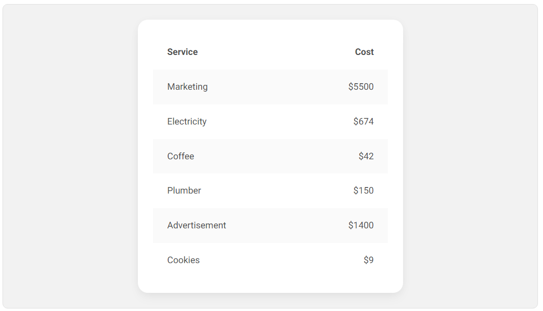
Content alignment in tables: DO :)
In left-to-right languages, text in tables should be left-aligned because that's what's most natural for the user.
Numbers, on the other hand, should be aligned to the right, as it is easier to compare them.
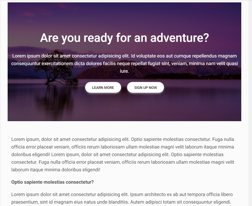
Overlaying text on images: DON'T :(
Be careful when overlaying text on an image. The lack of proper contrast can make the composition completely illegible.
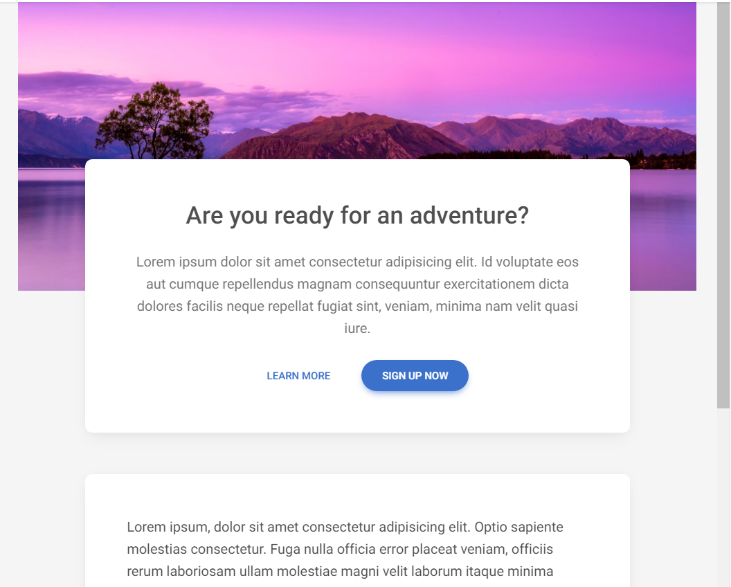
Overlaying text on images: DO :)
Linear gradient masks are a great solution. Thanks to them, you can give more contrast to the part of the image where the text is located, without having to cover the entire image with a mask.
Don't stretch your content more than you have to: DON'T
Do not stretch the text in a too long line. This reduces readability and makes reading difficult.
Remember that you don't always have to fill the 100% available space.
Don't stretch your content more than you have to: DO :)
Set the maximum width for the text, for example
550px. Thanks to this, the user will not lose the line and his eyes will be able to easily wander from one line to the next.
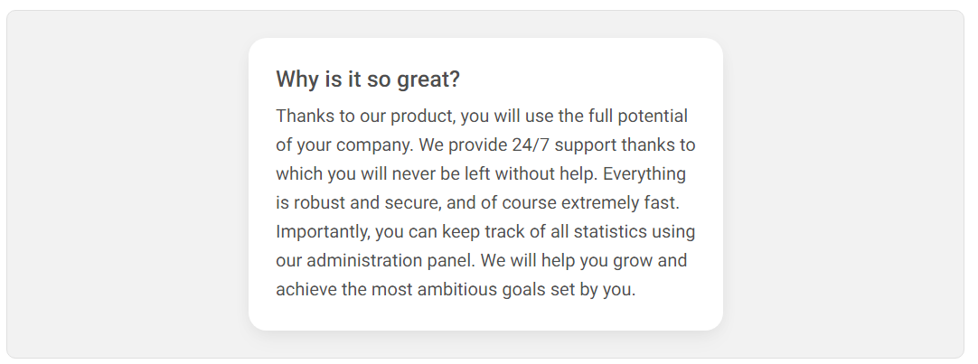
Breaking up dense text: DON'T :(
Avoid large, dense and monotonous paragraphs of text. Users hate them because there are no points for the mind to latch onto, so everything clumps together into one shapeless mass, the content of which we forget right after reading.
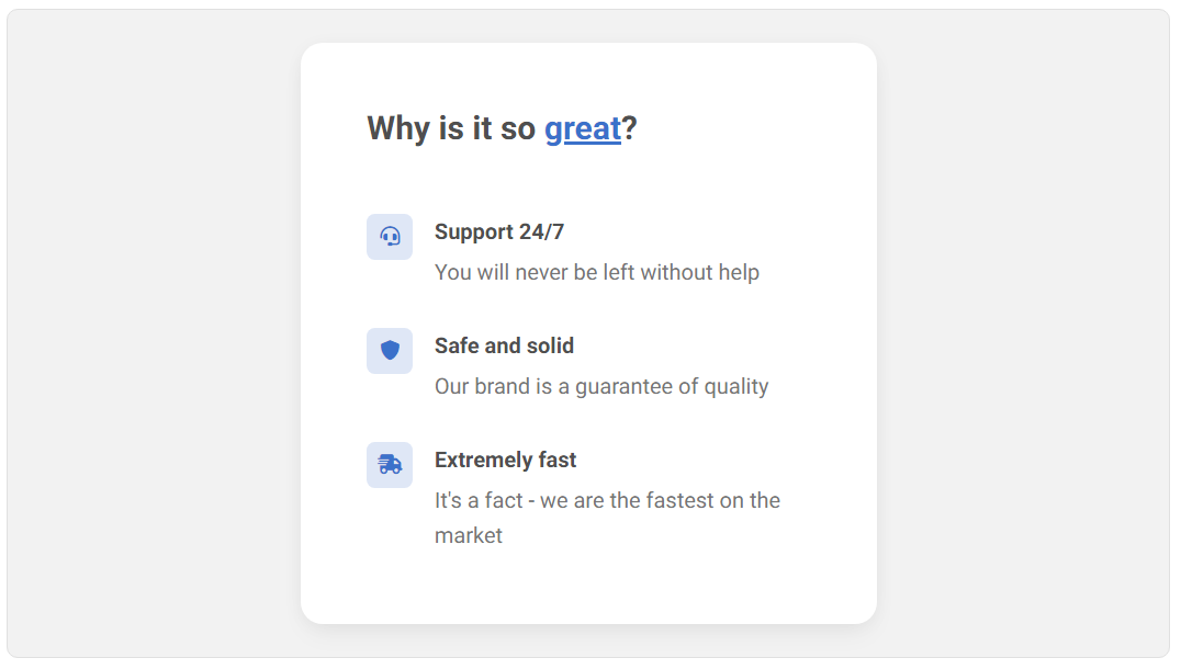
Breaking up dense text: DO :)
Use lists, icons, and highlighted headings so that the user can quickly scan the content and find the most interesting information.
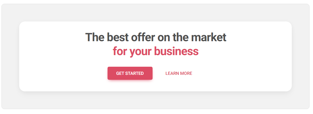
Optimal placement of CTA: DON'T :(
When creating a Call to Action, do not ignore the direction in which the language is processed by the user.
For example, English is read from left to right. So if you put the primary "Get started" button on the left side, the user will first process that button and then go to "Learn more" on the right.
To perform the action you want (i.e. clicking "Get started" button), he will have to get back to the left, which costs extra mental energy.
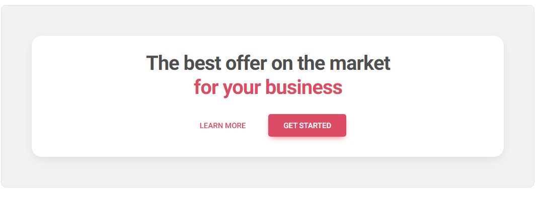
Optimal placement of CTA: DO :)
Always try to make life easier for the user. Create a UI that will require as little thinking and mental energy as possible. So place the primary button to the right to be the point where the user will end up.
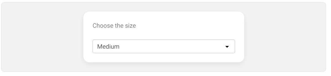
Radio buttons over select component: DON'T :(
Select component (a.k.a dropdowns) are very useful, but don't use it if you have only 2-4 options available.
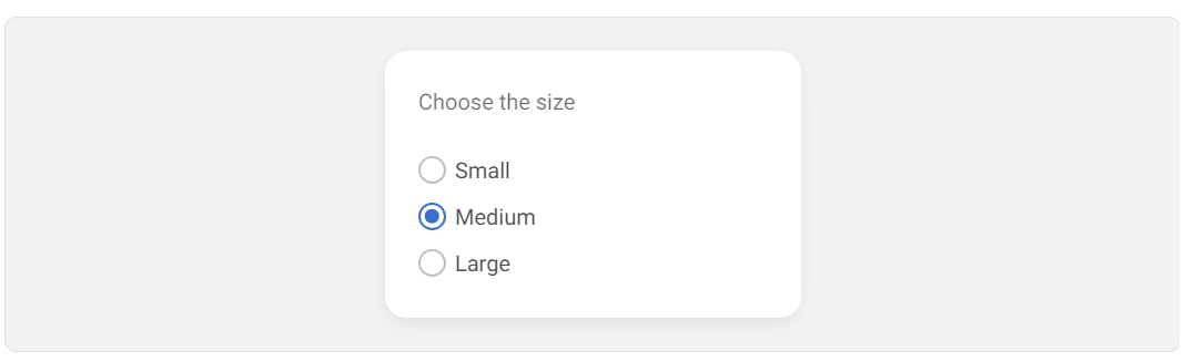
Radio buttons over select component: DO :)
Instead, use a component where all options are visible at once - e.g. radio buttons.
With only a few options to choose from, this is much more user-friendly as it saves the user the extra step of clicking a dropdown to expand it.
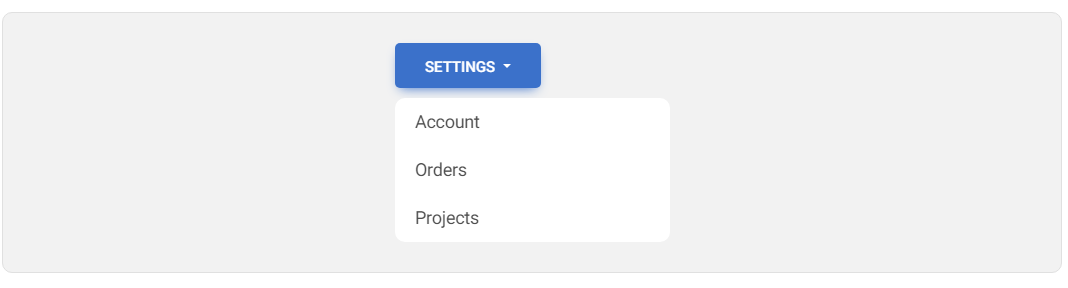
Importance of elevation: DON'T :(
The lack of elevation can disturb the hierarchy. For elements that are intended to stand out and attract attention (such as drop-down menus), the lack of a shadow makes the element appear to blend in with the background instead of standing out. This is especially problematic when there are elements with a shadow next to it (such as a button), which additionally distract attention.
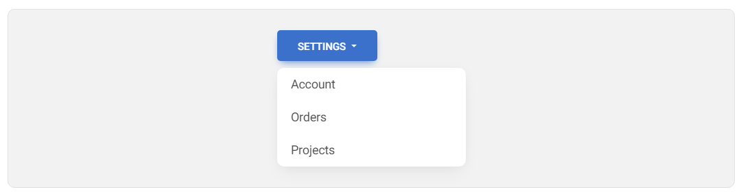
Importance of elevation: DO :)
Add a shadow to the drop-down menu to make it appear to be above other elements. Such an illusion of elevation makes elements with a larger (more diffused) shadow appear "higher" than the surface to the user, which attracts more attention.
Depth with overlapping technique: DON'T :(
The lack of elevation and a sense of depth can make our layout seem dull. All the elements lie on the same plane, so nothing really stands out.
Depth with overlapping technique: DO :)
Use the overlapping technique to give a sense of depth. Thanks to this, we not only give a hierarchy to individual elements, but also our design simply looks more interesting.
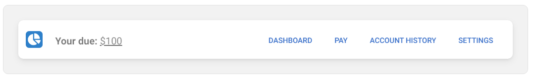
Emphasize Key Actions: DON'T
Avoid presenting too much information to the user at once, especially when it lacks a clear hierarchy and all actions seem equally important. In the example below there is a navbar with 4 links that look identical, although only one is really crucial. It takes extra effort on the part of the user to find it.
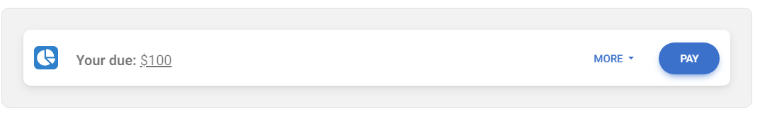
Emphasize Key Actions: DO :)
Hierarchy is fundamental. The user should always know what the main action is expected of him. Don't add more than one key action per view and make it stand out from other interface elements.
In this case, such a key action is the "pay" option, which has been changed from a simple link into a distinctive button. The remaining links have been placed in the dropdown menu ("more") as additional options.
Next part - UI / UX tips & tricks (part 3)
Material Minimal, which is basically Material Design on steroids can be found here on Figma.
Material Design for Bootstrap is a UI Kit, that uses Material Minimal, check it out here.
And TW Elements, our newest child is based on Tailwind CSS. Check it out


