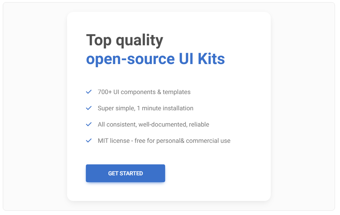
WebDesign Tutorial - UI / UX tips & tricks (part 1)
Material Minimal - Design less, impact more

This is part 25. You can find the part 24, Material Minimal Principles, here.
UI / UX tips & tricks (part 1)
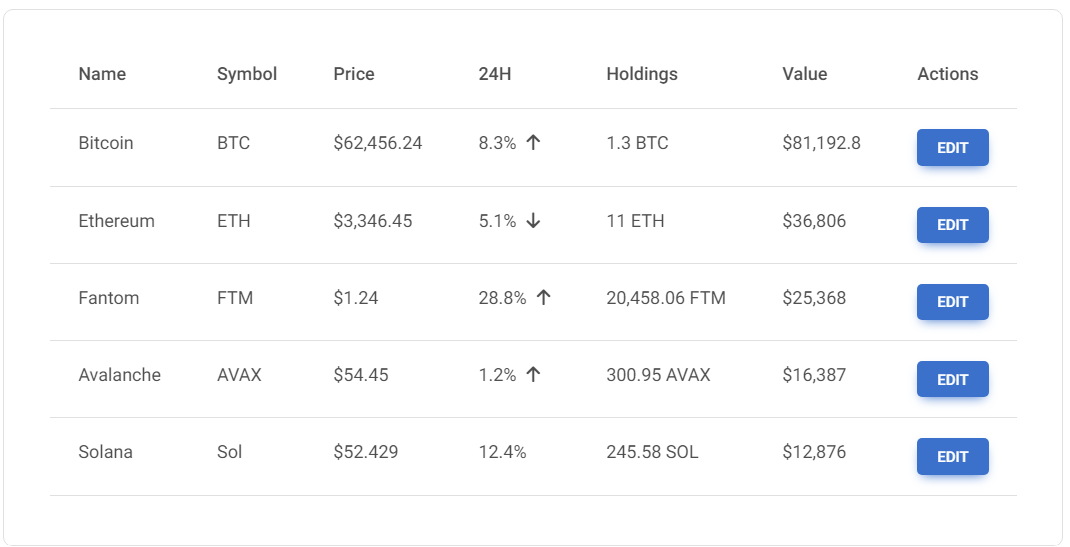
Revitalizing tables and data presentation: DON'T :(
Tables and data do not have to be presented in a monotonous and boring way. If possible, avoid the painfully standardized appearance as in the example below.
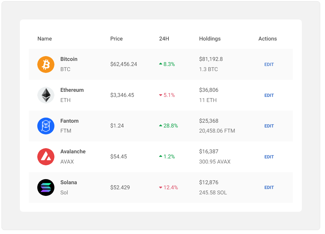
Revitalizing tables and data presentation - DO :)
While this is not always achievable (sometimes it needs to be pure data due to the need for sorting), it is a good idea to present your data in a variety of ways that will additionally dictate a hierarchy of the individual items.
However, be careful not to overdo it with diversity. The individual elements should be consistent with each other and not cause confusion for the user.
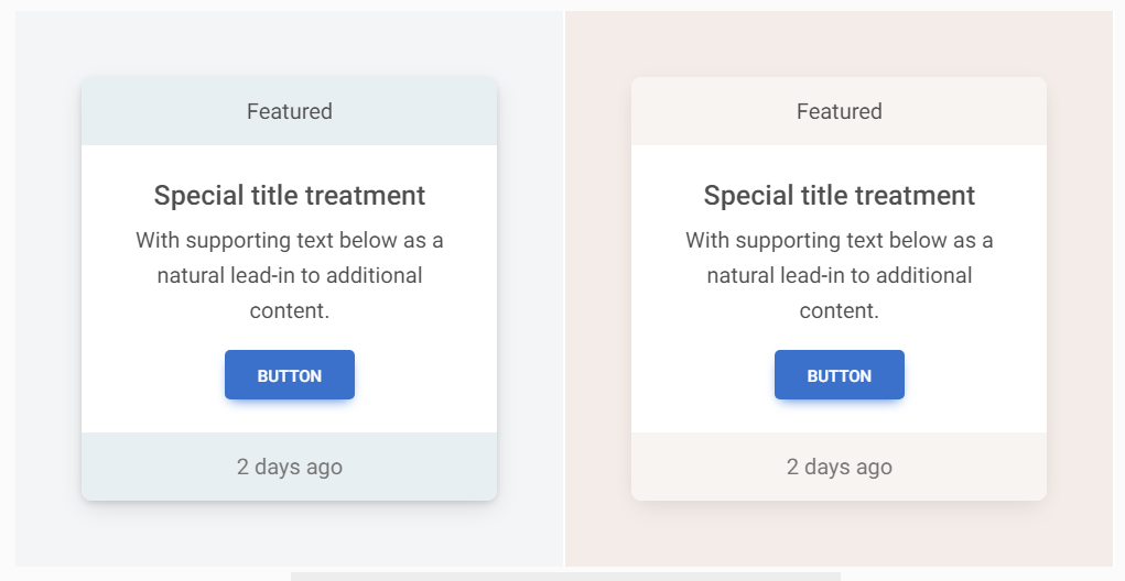
Rectangular buttons - boring, but effective: DON'T :(
Non-rectangular, unlabelled buttons are more difficult to process and take longer for the user to understand what they mean.
Rectangular buttons - boring, but effective: DO :)
Classic, rectangular buttons with appropriate text are simply the best solution.
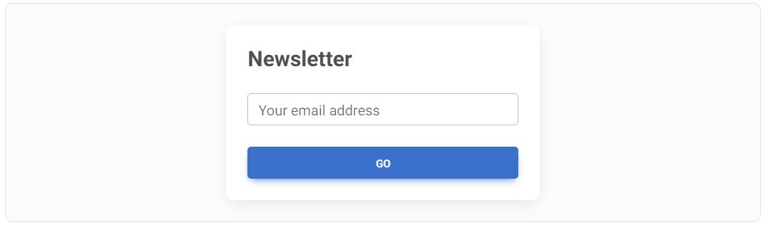
Avoid unclear CTA phrases: DON'T :(
In "Call to action" buttons, too general phrases such as "Go", "OK", "Next" can be confusing to the user and are better avoided.
Avoid unclear CTA phrases: DO :)
"Call to action" should contain precise information for the user what to expect as a result of clicking the button. Thanks to this, you will minimize the user's mental effort, who will not have to wonder what should happen next.

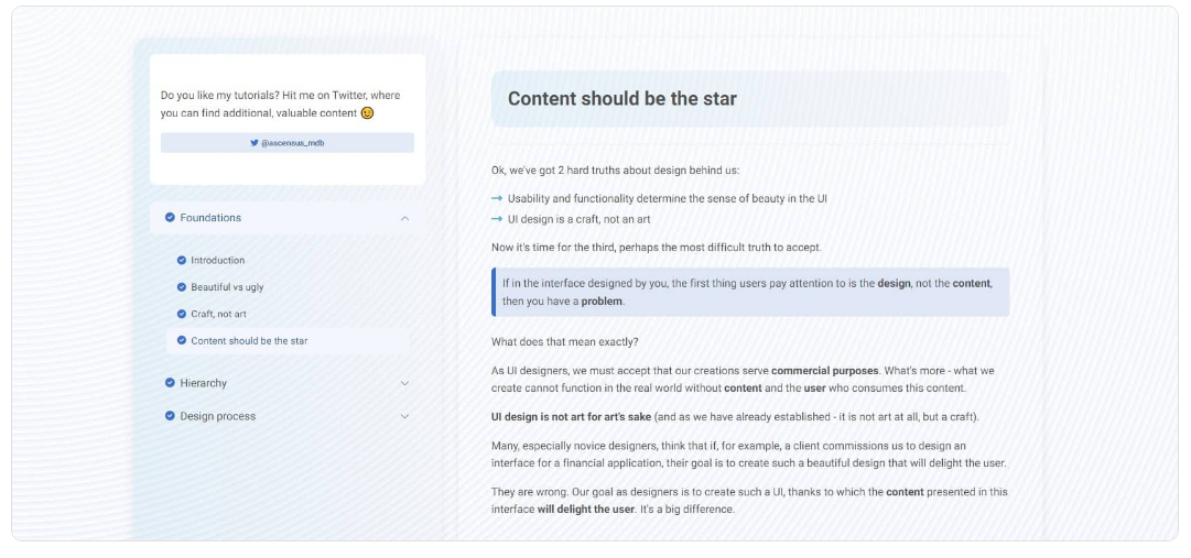
Content should be the star: DON'T :(
I know it's hard to accept, but your design is not the most important thing.
The most important thing is the content. So if you overdo it with the design and add, for example, a patterned background, intense gradients, fancy shapes, and flashy animations, you will overshadow the content.
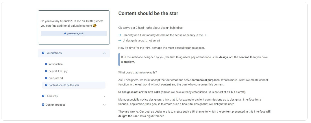
Content should be the star: DO :)
Take a minimalist approach. The design here should be just a stage, which is supposed to allow the main actor - the content - to present itself in the best possible way.
The stage must not distract from the actors, because people do not come to the theatre for the sake of the stage itself.
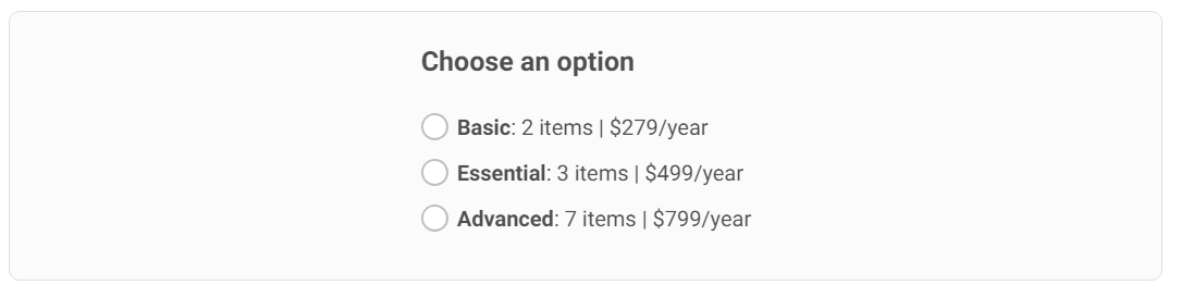
Styling for radio buttons alternatives: DON'T :(
Get creative even with boring components like radio buttons. It does not always have to be a list like in the example below.
Styling for radio buttons alternatives: DO :)
A bit of creativity with a little help from CSS can turn a monotonous list of options into aesthetically pleasing and interesting cards.
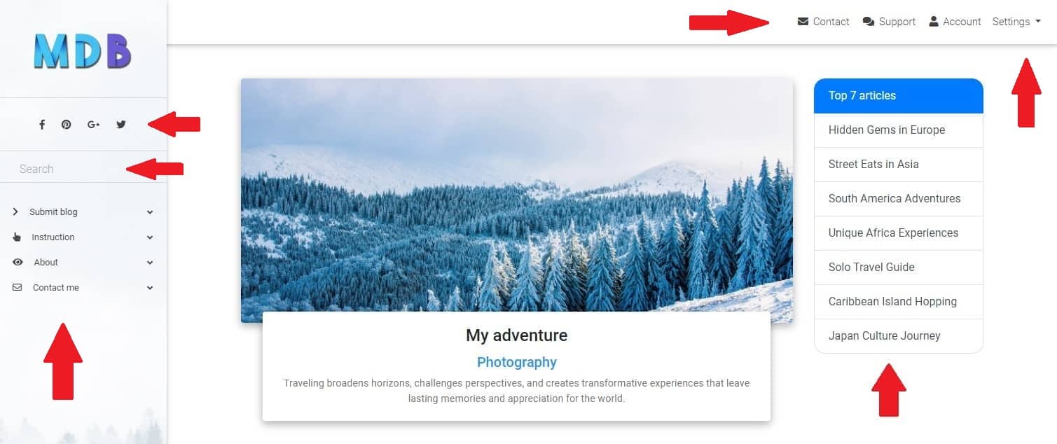
Less is more: DON'T :(
Avoid creating overly complex interfaces.
If you're creating a simple blog for a client, don't immediately assume that they will need the main navigation on the top, secondary navigation on the left, suggested content on the right, search bar, social icons, settings dropdown, etc.
Do not try to address all potentially possible future scenarios at the beginning, because you will create an overcomplicated monster.
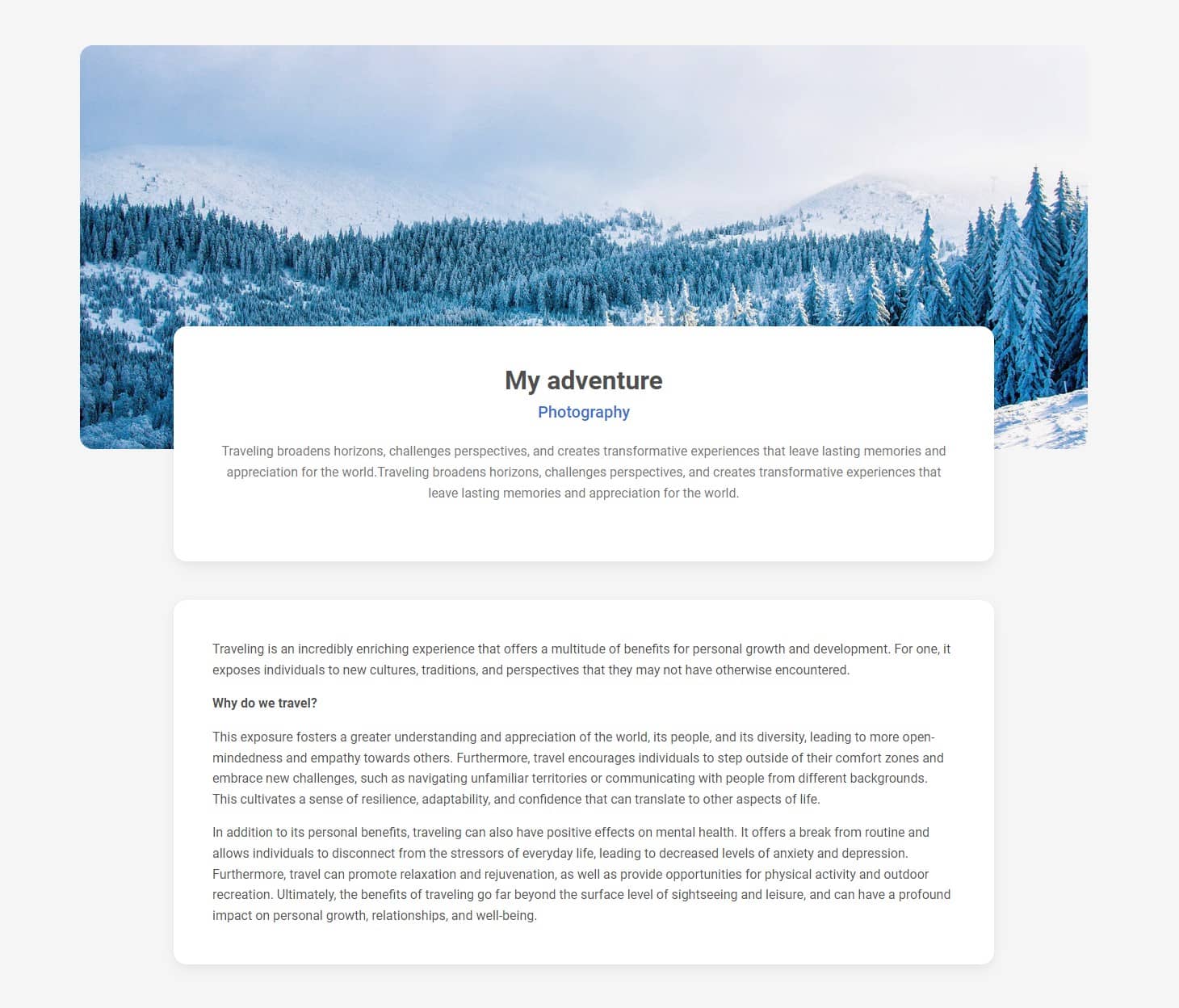
Less is more: DO :)
Start as clean and minimalist as possible.
Users come to your blog to read the text and will be relieved when your interface will expose text instead of a large number of options and functionalities.
Be consistent in icon design: DON'T :(
Avoid mixing filled icons with outlined icons as this creates the impression of inconsistency and clutter.
Be consistent in icon design: DO :)
Always be consistent in your design and use the same style throughout the project.
The UI shouldn't be a rainbow: DON'T :(
Don't overdo it with colours.
Too many different, intense colours will make the interface look chaotic and cluttered. Each element will compete for the user's attention and cause cognitive overload.
The UI shouldn't be a rainbow: DO :)
Choose colours carefully so that they don't attract more attention than they need to.
Remember that your most important colours are different shades of gray. However, if you feel that an element disturbs the visual hierarchy through its intense color - desaturate it and make it more greyish.
Revive your bullets with icons: DON'T :(
Bullets are useful, but can also seem dull and bland.
Revive your bullets with icons: DO :)
Use icons to add some life to your design. Also, make sure that the icons are color consistent with the rest of the surrounding interface.
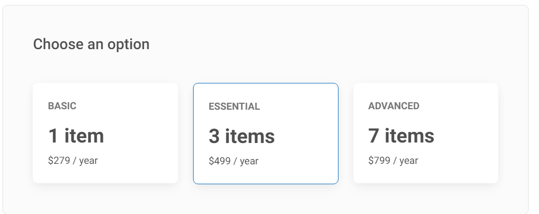
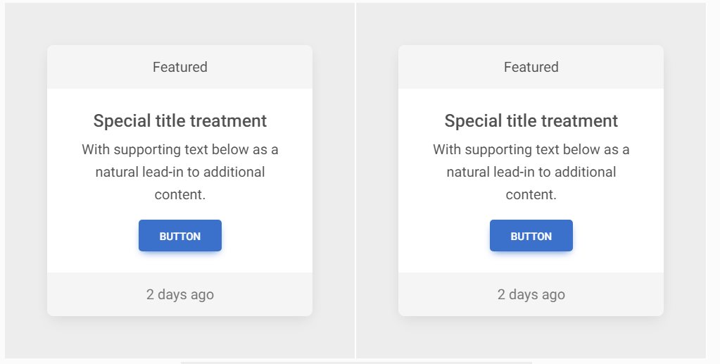
De-emphasize instead of emphasizing: DON'T :(
If you want to emphasize an element, such as a button in the middle card, you don't need to make it bigger or bolder.
The effect is often bizarre, like the unnaturally large button in the example below.
De-emphasize instead of emphasizing: DO :)
So instead of forcibly increasing the visibility of a given element - lower the visibility of surrounding elements.
For example, you can grey out the buttons in the side cards so they don't compete for attention with the middle button.
Be careful with tooltips: DON'T :(
Tooltips are useful, but don't use them for information that should be immediately visible to the user.
In the example below, the user must hover over "?" to see important information.
Be careful with tooltips: DO :)
Important information should be visible immediately, without the need to perform any additional actions, such as hovering over the icon with the tooltip.
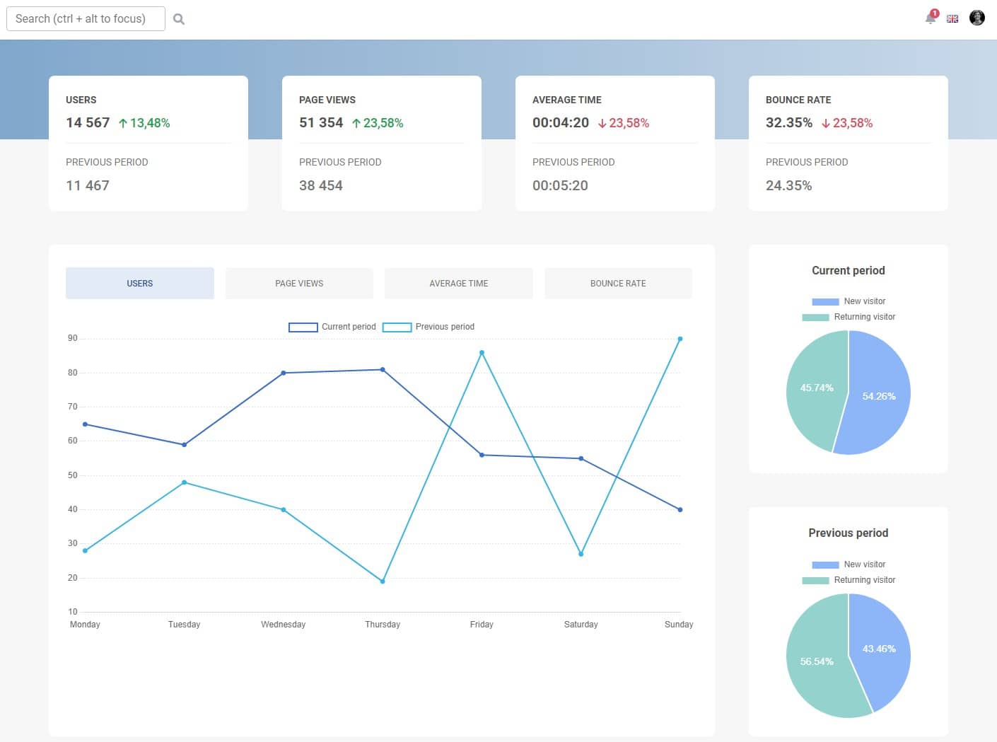
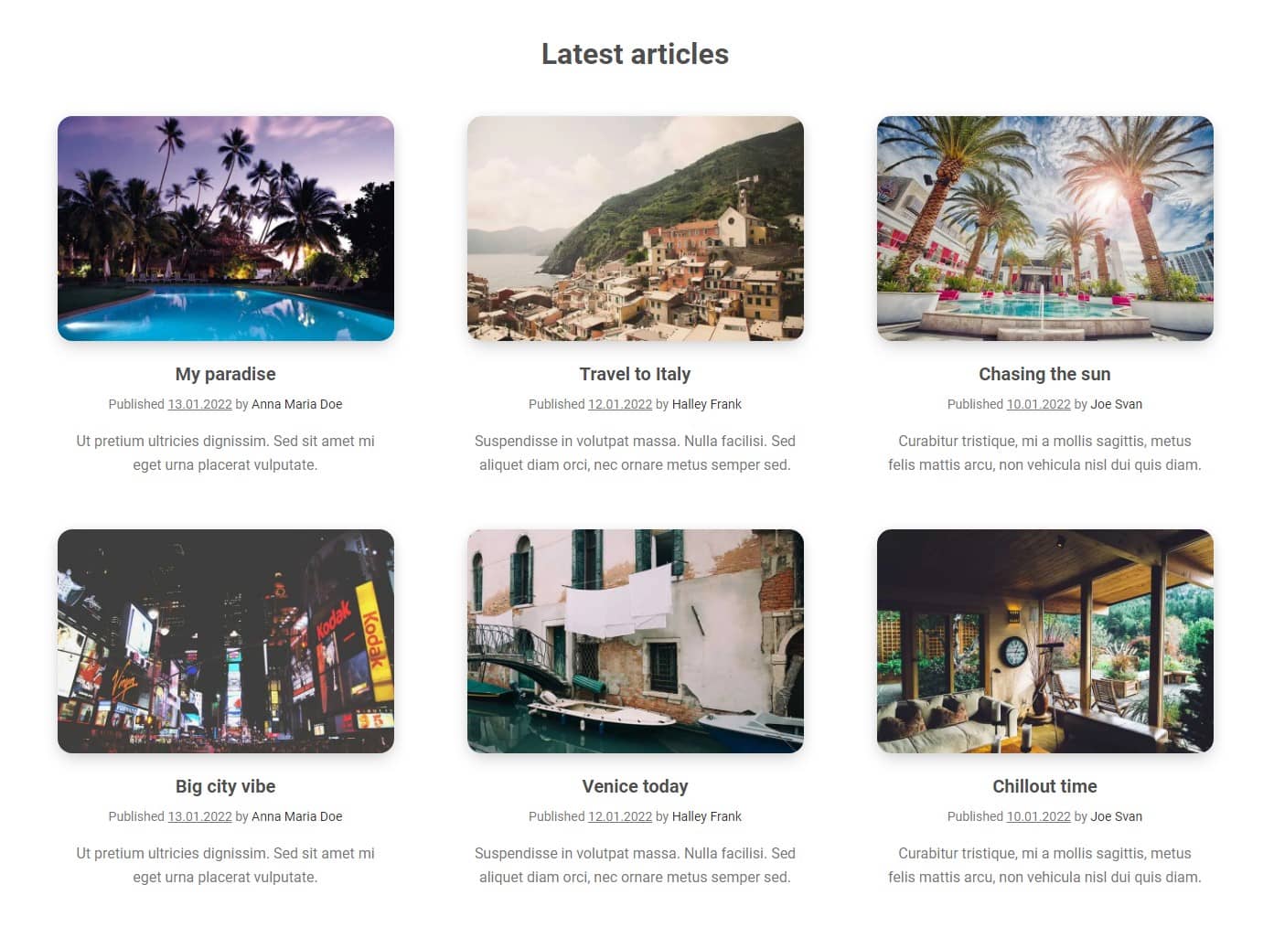
Decide what is really primary: DON'T :(
Don't think schematically and do not treat Call to Action buttons as always the most important thing by default.
Take, for example, this article listing. Here we have six Call to Action "Read more" buttons fight for our attention.
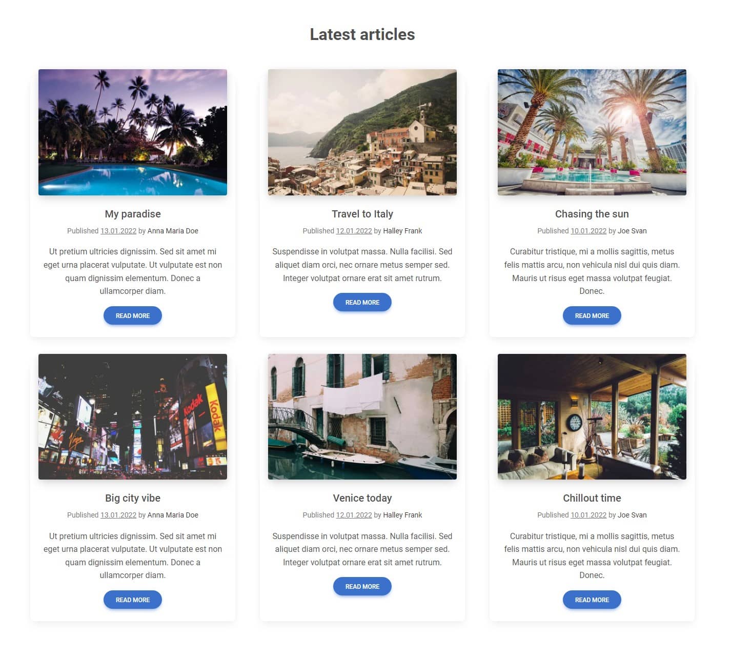
Decide what is really primary: DO :)
The truth is that it is the photos that should catch our attention the most. In the era of Instagram and visual content, users scan the interface with a pattern in search of attractive graphics.
It is already standard that clicking on the photo takes the user further, so why do we need buttons at all?
50 shades of grey: DON'T :(
Gray is the most important and commonly used colour in UI design because it is the most user-friendly. However, this does not mean that it always has to be the same. You definitely shouldn't limit yourself to just one shade of grey.
50 shades of grey: DO :)
You can mix grey with other colours to create interesting shades of gray subtly brushed with red, blue, or any other colour. Thanks to this, your design will literally take on colours, while not losing the clarity and usability that grey provides.
Use the Colour scheme generator to find the perfect shades.
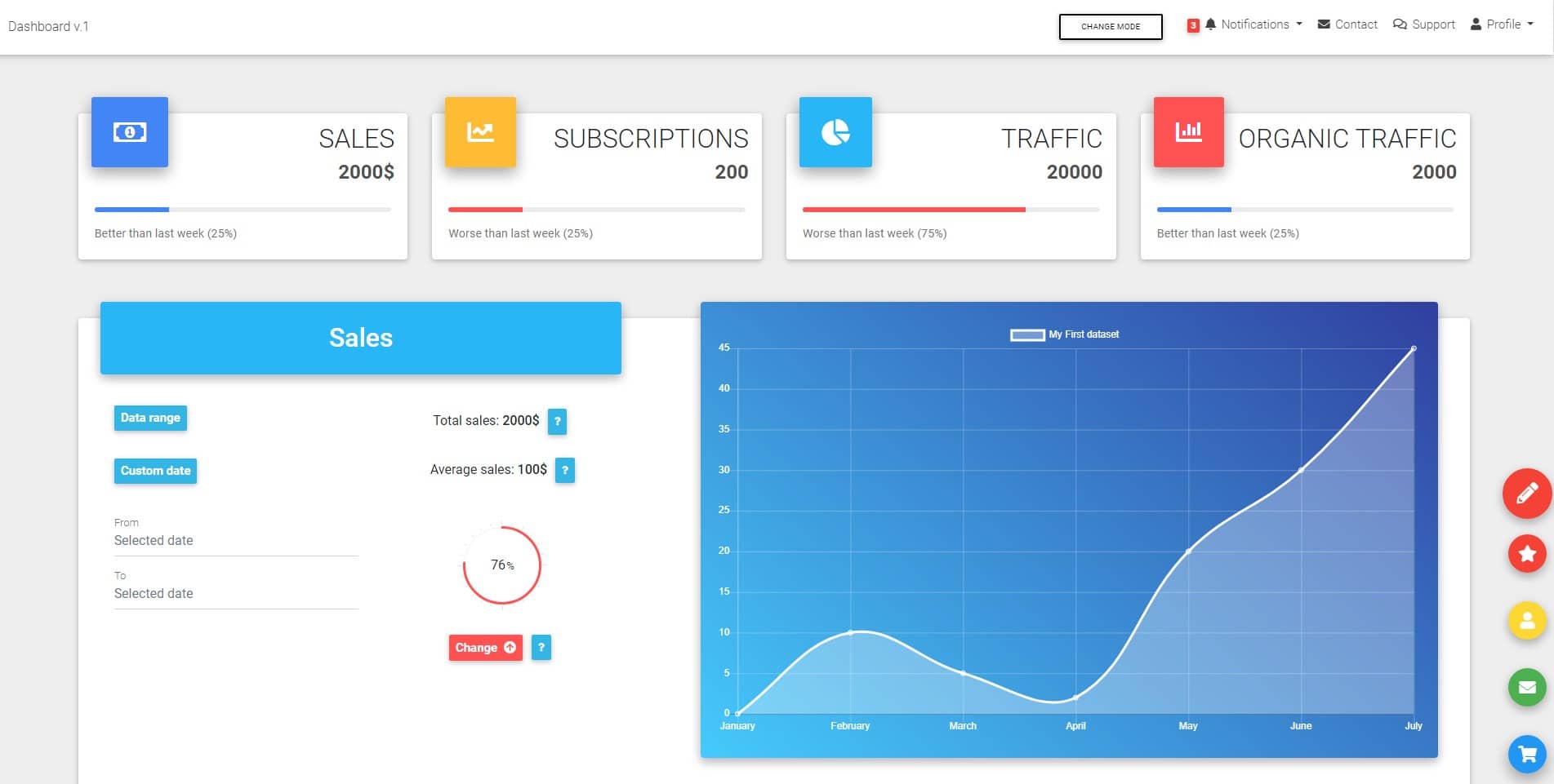
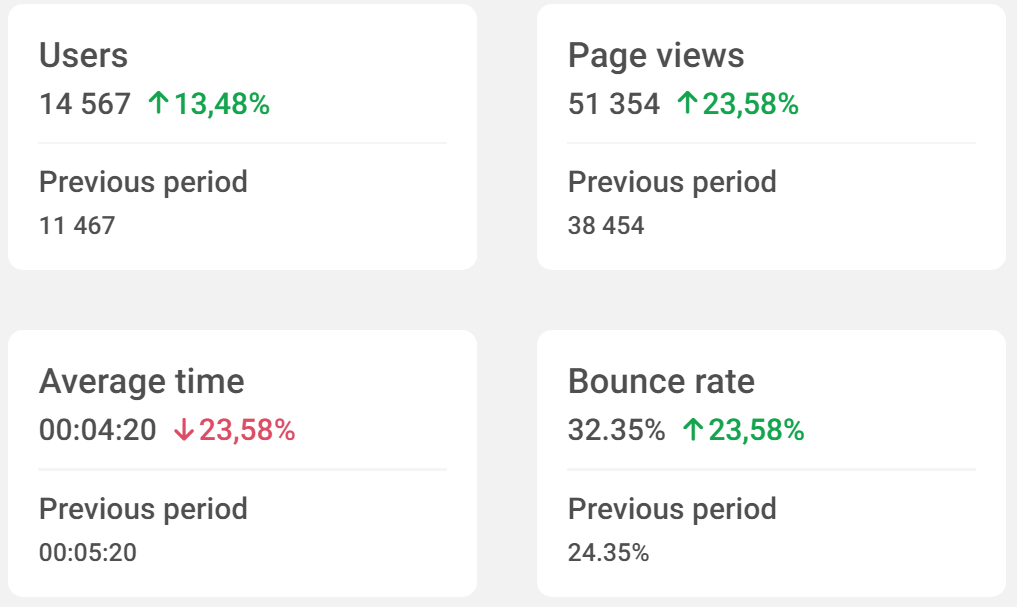
The document hierarchy should not dictate the visual hierarchy: DON'T :(
Don't rely on HTML heading sizes to build a visual hierarchy, or you will end up with a monster like the one below.
Here we used h3 elements for card titles ("Users", "Page Views" etc.) and smaller h4 headings for main statistics and even smaller h5 headings for previous period statistics.
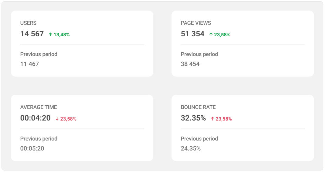
The document hierarchy should not dictate the visual hierarchy: DO :)
HTML semantics should not dictate what the element should look like.
This means that, for example, the title of the card, although it will remain an h3 element (i.e. semantically with the highest weight among those present in this card), we style it so that it looks less important.
Why? Because it is only a label, which, although important, should not dominate over the most important element - the main statistic.
Then, instead of relying entirely on typography size, we'll also use font weight and colour to establish hierarchy.
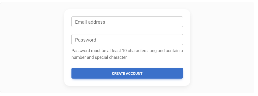
Don't use unclear spacing: DON'T :(
If you leave the same spacing between the labels for a given input and the input above, the user will be confused, not being able to easily assign which label belongs to which field.
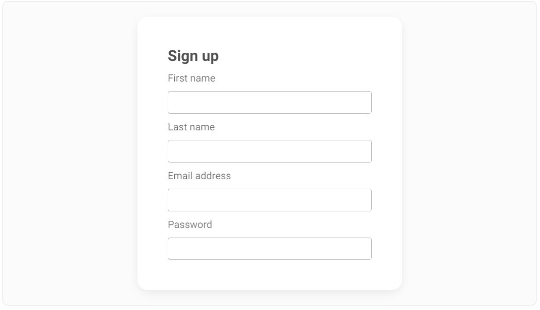
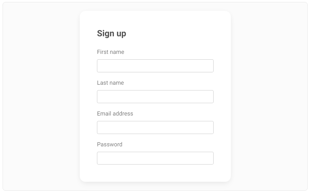
Don't use unclear spacing: DO :)
Provide sufficient distance so that the user has no doubts about which label belongs to which input field.
Next part - UI / UX tips & tricks (part 2)
Material Minimal, which is basically Material Design on steroids can be found here on Figma.
Material Design for Bootstrap is a UI Kit, that uses Material Minimal, check it out here.
And TW Elements, our newest child is based on Tailwind CSS. Check it out


