WebDesign Tutorial - Material Minimal principles
Material Minimal - Design less, impact more

This is part 24. You can find the part 23, Material Minimal Core Values, here.
Material Minimal principles
In the previous lesson, we listed the most important principles of Material Minimal, which result from the core values of this design system.
Now let's look at all of these points one by one.
Accessibility and usefulness
Material Minimal puts the user and his comfort first. Design is not an end in itself, but only a tool to provide users (also for those with disabilities) with the best possible experience when interacting with the interface.
Therefore, when using Material Minimal, the designer should ask himself when creating each interface element:
- "Is this really helpful to the user? Or is it just to satisfy my vanity and need for artistic expression?
Creativity is welcome in Material Minimal, but it can never conflict with accessibility and usability.
Hierarchy
The user should be able to easily identify the key interface elements and the actions we expect from him. At the same time, we cannot overload the user with too much information and expect several actions from him at once. Therefore, interface elements should have a clear and distinct hierarchy.
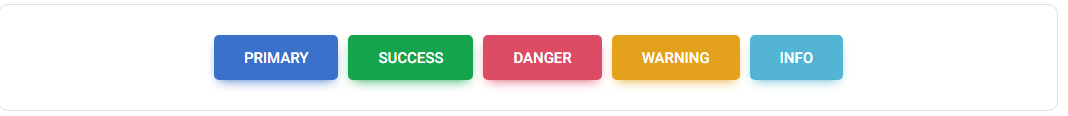
Buttons are a good example here.
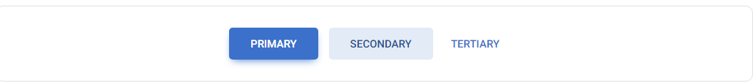
User should be able to easily identify which button is the most important (primary button), which is less important (secondary button) and which presents completely additional information (tertiary button).
Elements with strong, filled backgrounds and shadows attract attention the most, which is why button primary is built in this way.
A delicate background without shadows is less engaging, so it is well suited for button secondary.
The lack of background and shadow makes the element the least visible. These features characterize the button tertiary.
How it could look like in a real life composition:
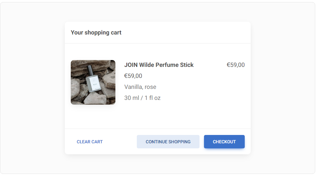
Remember: there should be only one key action in a given view, represented, for example, by a primary button. Never use more than 1 primary button in a given view, otherwise you will confuse your user.
The secondary and tertiary buttons, however, can appear many times (but be careful not to overdo them as well).
Contrast
Contrast is of particular importance, not only for accessibility but simply for a better experience for every user.
Material Minimal strictly adheres to the Web Content Accessibility Guidelines (WCAG) to ensure a sufficient contrast ratio in the interfaces.
Note: Use the contrast measurement tool to make sure your colours meet WCAG requirements.
The problem, however, is that clear and strong contrast can significantly reduce the aesthetics of interface elements.
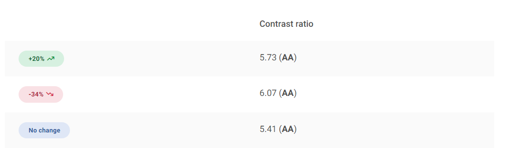
Badges are a good example here. Have a look at the demo below - these badges are subtle and look nice, but as you can check in the contrast measurement tool, they fail to provide a contrast that is strong enough.
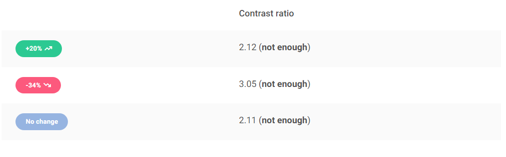
We can increase the contrast by using darker colours like backgrounds for the badges, but this raises a new problem - in this form they are really heavy and attract all the user's attention (and they shouldn't, because badges are usually an additional component)...
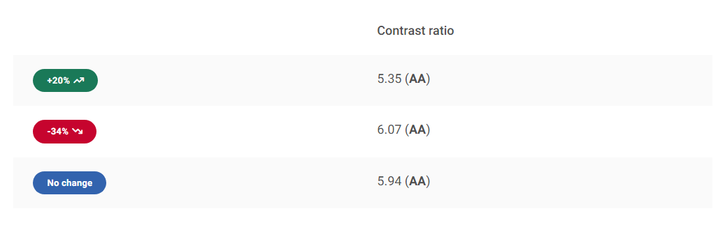
But let's try invert the contrast. By using a similar hue but in different shades (lighter for background and darker for text) we can achieve an effect that is both light and visually attractive, while at the same time providing a strong enough contrast.
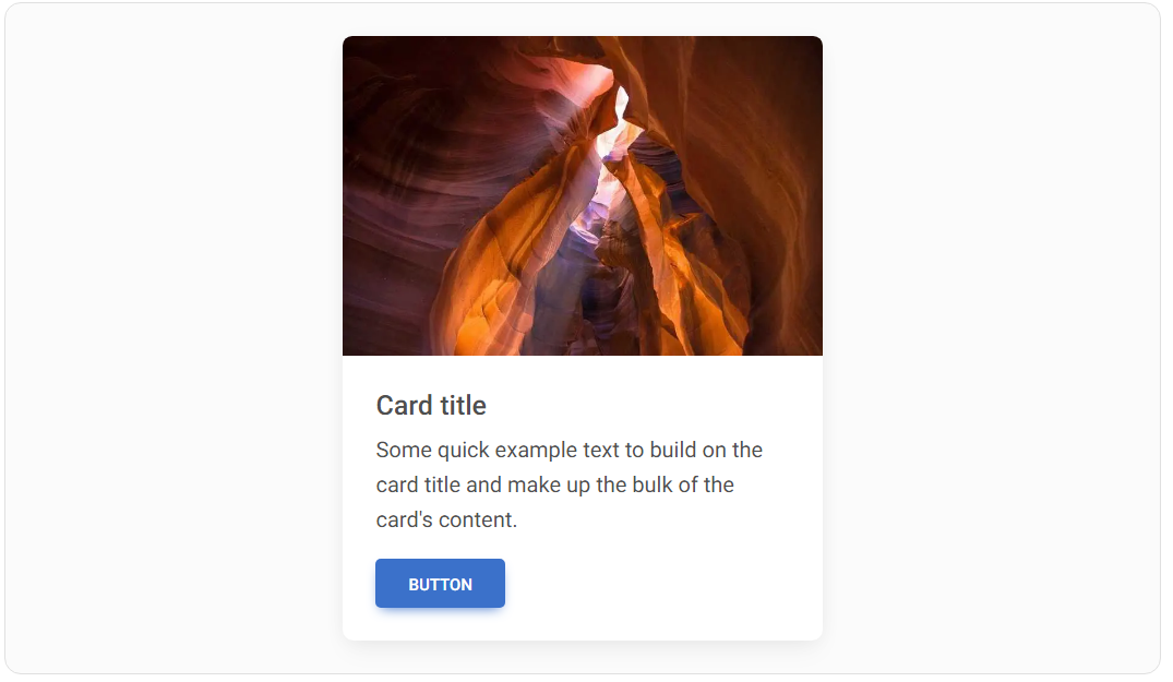
Shadows
As in Material Design, shadows play a big role in Material Minimal. However, they are definitely more subtle here - they have brighter colors and are often more extensive.
Unlike Material Design, Material Minimal is not afraid to use colored shadows, which can be seen in the example of our buttons. However, these are always delicate accents, as Material Minimal values subtlety and avoids exaggeration.
The shadows are undoubtedly one of the most distinctive features of Material Minimal and give it a special flavor.
For light design and bright compositions Material Minimal uses delicate shadows on a five-grade scale.
For dark design and dark elements strong shadows are used (also on a five-grade scale).
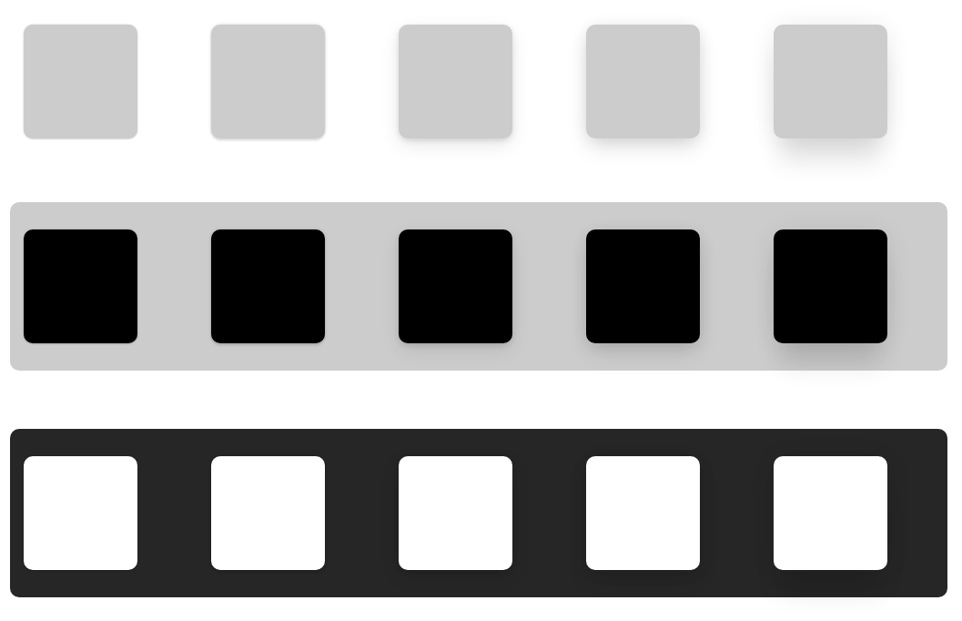
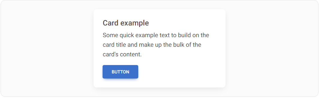
For most components (such as cards or modals) Material Minimal uses standard, soft shadows of level 4.
/* Default, soft shadow of level 4  */
box-shadow: 0 2px 15px -3px rgb(0 0 0 / 7%), 0 10px 20px -2px rgb(0 0 0 / 4%)
In MDB UI KIT and Tailwind Elements they are added by default to the component.
Button shadows are subtly brushed with a colour that matches their background colour.
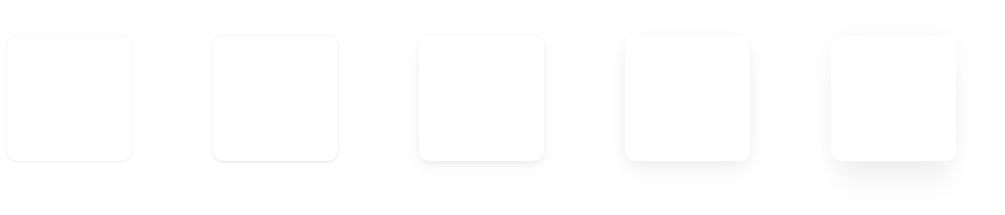
Roundings
The UI elements in Material Minimal are gently rounded to provide the design more friendly and organic look (rounded corners are proven to be more pleasing to the human eye than sharp ones).
In MDB UI KIT you can apply rounded corners by using predefined classes on a scale from 1 to 9.
<!-- border-radius: 0px; -->
<img src="..." class="rounded-0" alt="...">

<!-- border-radius: .2rem; -->
<img src="..." class="rounded-1" alt="...">

<!-- border-radius: .25rem; -->
<img src="..." class="rounded-2" alt="...">

<!-- border-radius: .3rem; -->
<img src="..." class="rounded-3" alt="...">

<!-- border-radius: .375rem; -->
<img src="..." class="rounded-4" alt="...">

<!-- border-radius: .5rem; -->
<img src="..." class="rounded-5" alt="...">

<!-- border-radius: .75rem; -->
<img src="..." class="rounded-6" alt="...">

<!-- border-radius: .1rem; -->
<img src="..." class="rounded-7" alt="...">

<!-- border-radius: 1.25rem; -->
<img src="..." class="rounded-8" alt="...">

<!-- border-radius: 1.5rem; -->
<img src="..." class="rounded-9" alt="...">
Whitespace
Material Minimal loves wide spaces. It's a style that needs to breathe.
The content is usually presented on a white background (or a dark one in the case of a dark theme). Colourful backgrounds with intense colours are avoided. Only backgrounds slightly touched with a diffused colour are allowed.
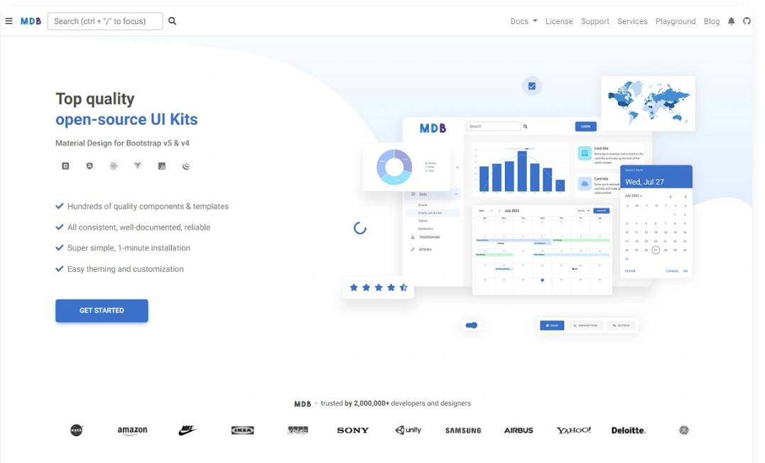
The home page of mdbootstrap.com is a perfect example.
To ensure enough space between sections or UI elements, in MDB UI KIT you can use a special bottom margin with predefined spacing classes.
Details
Despite its minimalistic form, Material Minimal pays huge attention to details.
The intro section of the mdbootstrap.com homepage is again a good example. A large amount of space, the limited use of colours, and the lack of distracting effects did not result in a lack of attention to detail. Quite the opposite.
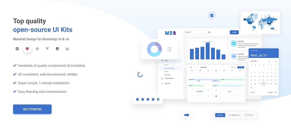
All colours are carefully selected here according to a monochromatic pattern, so that on the one hand they blend well together, and on the other hand, they do not distract the user and not distract from the most important action, i.e. the "Get Started" button.
You can also see quite intense, but without exaggeration, the use of icons.
Under the main heading, you can see the logos of the supported technologies. After hovering over one of them, we see a subtle shadow effect. In addition, the logo takes on its branding colour (angular - red, react - blue, and so on).
In the background of the section, we see a wavy shape with a colour gradient that matches the overall composition. This shape is carefully matched to the graphics on the right, and the whole thing is to give the composition a light, "cloud-like" and flowing style.
As you can see, in such a relatively simple section there are many details that are imperceptible at first glance. However, they give the "magic" to the Material Minimal style and are crucial in creating interfaces that will delight the user.
Photos
As one of the key values of Material Minimal is naturalness, photos should also apply to it.
Material Minimal prefers photos of real objects and real people (although this is not a strict rule). Exaggerated editing, very strong filters or caricatured characters do not fit well with the principles of this style.
The illustrations used should be as close to reality as possible.
Effects
Material Minimal is very reluctant to exaggerate effects and distracting animations. Instead, it prefers subtle, complementary effects that will complement the composition rather than dominate it.
Hover effects are a good example here.
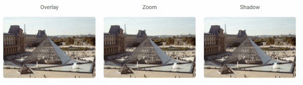
As you can see, the effects are minimalistic and in line with the spirit of Material Minimal.
It is also unacceptable to add functional UI elements (e.g. buttons) activated only by hovering over them with the cursor. This violates the fundamental principle of "mobile first", because it makes the essential interface elements hidden by default and only hovering over them reveals them. This greatly decreases the user experience on mobile devices, so such practices are completely rejected in Material Minimal.
Besides, MDB UI KIT provides a wide variety of animations for you to use. However, use them wisely, so as not to violate the Material Minimal principles.
Next part - UI / UX tips & tricks (part 1)
Material Minimal, which is basically Material Design on steroids can be found here on Figma.
Material Design for Bootstrap is a UI Kit, that uses Material Minimal, check it out here.
And TW Elements, our newest child is based on Tailwind CSS. Check it out!


