WebDesign Tutorial - UI / UX tips & tricks (part 3)
Material Minimal - Design less, impact more

This is part 27. You can find the part 26, UI / UX tips & tricks (part 2), here.
UI / UX tips & tricks (part 3)
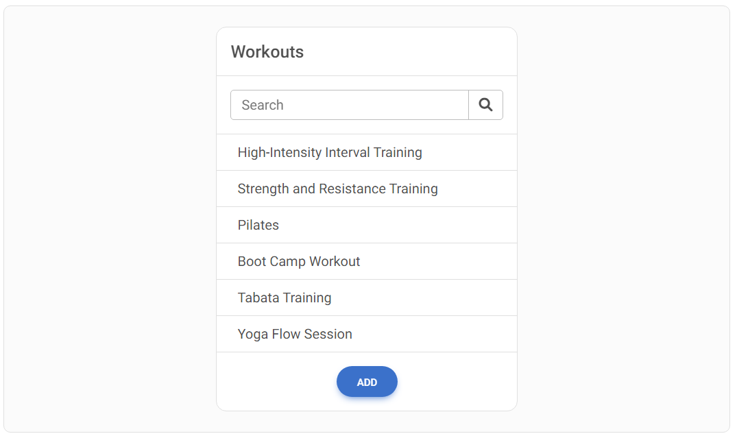
Avoid overusing borders: DON'T :(
Don't overuse the borders. While they seem like a natural solution for separating individual elements, they nevertheless give the interface some heaviness. As a result, the card below seems messy and bulky.
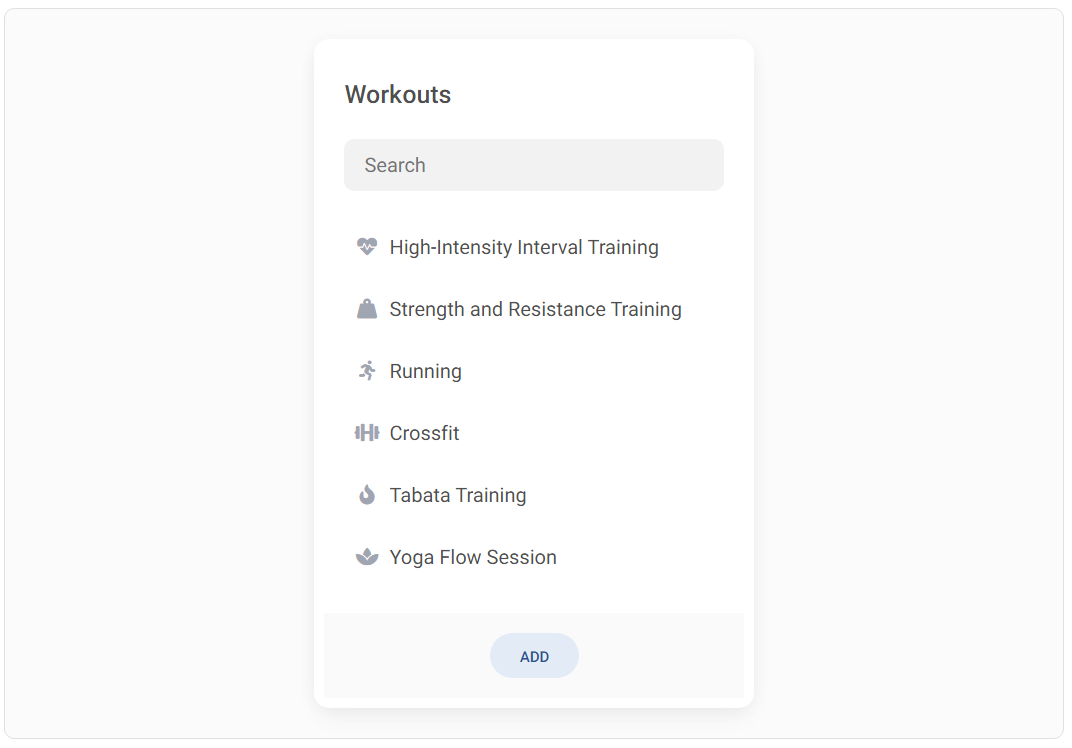
Avoid overusing borders: DO :)
Instead, use a combination of shadows and gray backgrounds. Additionally, increase the space between the elements, thanks to which the design will be able to "breathe". You can also enrich the UI with icons.
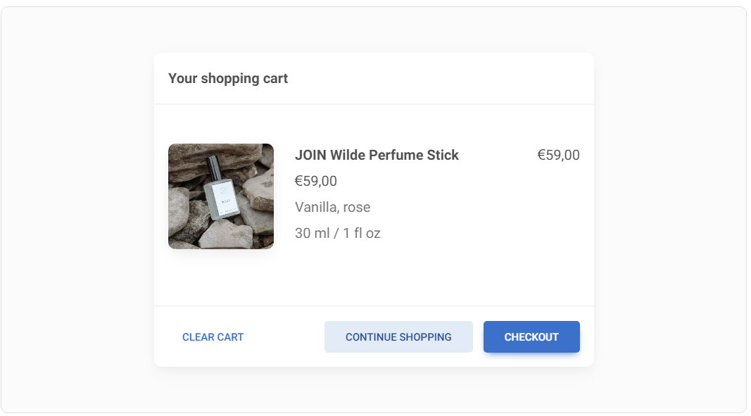
Prioritize user actions: DON'T :(
Prioritize user actions: DO :)
User should be able to easily identify which button is the most important (primary button), which is less important (secondary button) and which presents completely additional information (tertiary button).
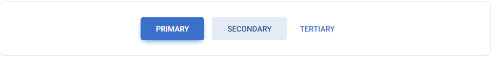
Elements with strong, filled backgrounds and shadows attract attention the most, which is why button primary is built in this way.
A delicate background without shadows is less engaging, so it is well suited for button secondary.
The lack of background and shadow makes the element the least visible. These features characterize the button tertiary.
Simplify Labels and Prioritize Data Hierarchy: DON'T :(
Usually, it's not the labels that are most important, but the data. And in the vast majority of cases, the data does not require a label because it is clear enough on its own.
Take advantage of this trait and give up labels wherever possible. At the same time, impose a clear hierarchy so that the user can easily identify the most important information.

Simplify Labels and Prioritize Data Hierarchy: DO :)
Usually, it's not the labels that are most important, but the data. And in the vast majority of cases, the data does not require a label because it is clear enough on its own.
Take advantage of this trait and give up labels wherever possible. At the same time, impose a clear hierarchy so that the user can easily identify the most important information.
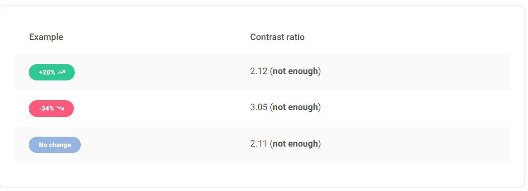
Avoid unintended attraction with contrast: DON'T :(
If you want to maintain adequate contrast, white text on a dark background is not the only solution. This way you will make the elements look really heavy.
Additionally, due to a very dark background, they can attract more user attention than you planned. In the example below, you can see badges, which by definition are a secondary elements, but because of their dark and heavy colours, they attract more attention than they should.
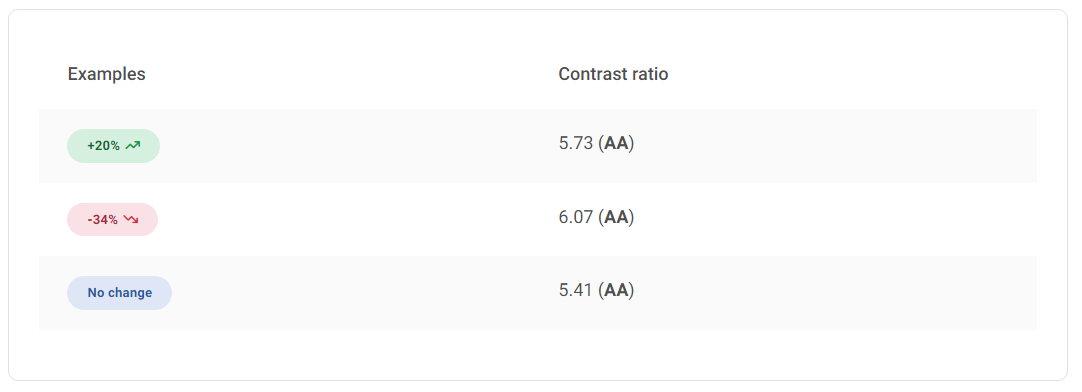
Avoid unintended attraction with contrast: DO :)
Invert the contrast. By using a similar hue but in different shades (lighter for background and darker for text) we can achieve an effect that is both light and visually attractive, while at the same time providing a strong enough contrast.
The text colour should match the background colour: DON'T :(
We often use grey text for secondary elements to reduce their visibility and thus maintain the hierarchy. However, grey text only works well on a white background.
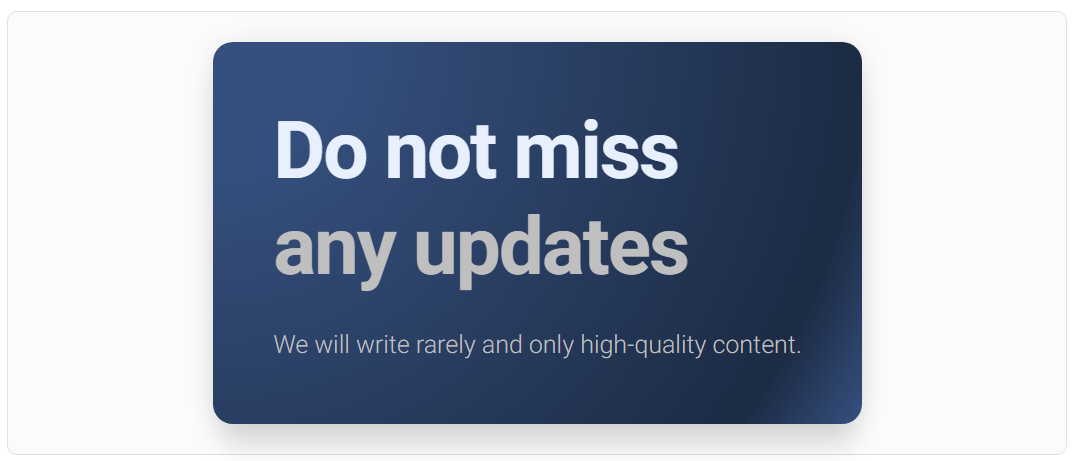
The text colour should match the background colour: DO :)
In the case of a coloured background, it will be best if we choose a shade similar to the background colour for the text. The more the text colour is similar to the background colour, the less contrast there will be between them, and thus less visibility.
So leave the most important element in white, so that it contrasts the most and attracts the most attention. On the other hand, reduce the contrast of the secondary elements so that they are still visible, but do not compete for attention with the primary element.
Thanks to this, we not only maintain a clear hierarchy, but also a coherent and aesthetic composition of colours.
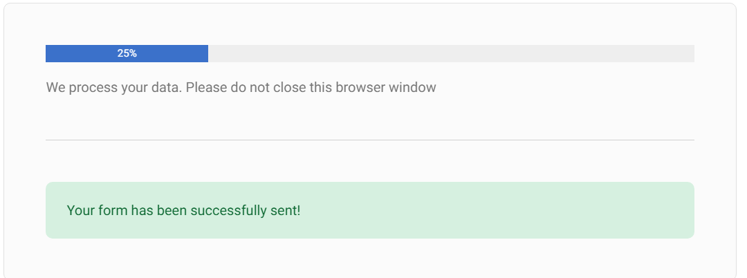
No matter what, always provide feedback: DON'T :(
You know that feeling when you fill out a form on some website, click "submit" and a moment later you are taken to the home page out of nowhere, without any information whether there was an error or maybe everything went right?
Or you click a button and nothing seems to happen, but all of a sudden you find that an app in the background was processing data but didn't tell you to wait?
It's hard to imagine a more frustrating user experience.
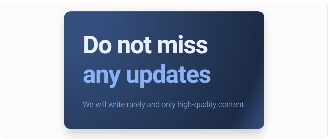
No matter what, always provide feedback: DO :)
There are plenty of ways to provide user feedback - progress bars, notifications, animations and more. Use them generously and, no matter what, always make sure that the user knows what is happening at the moment.
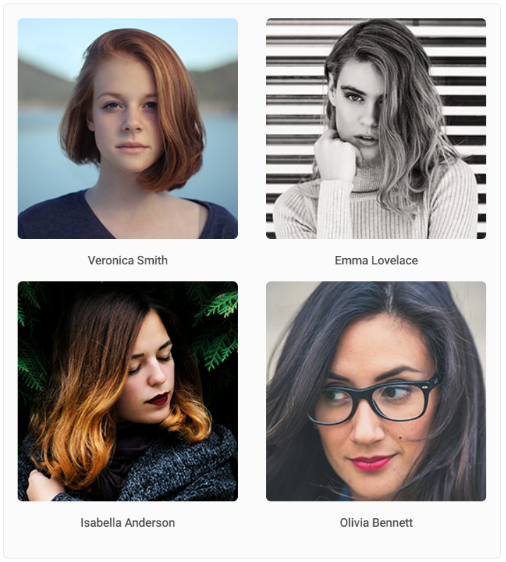
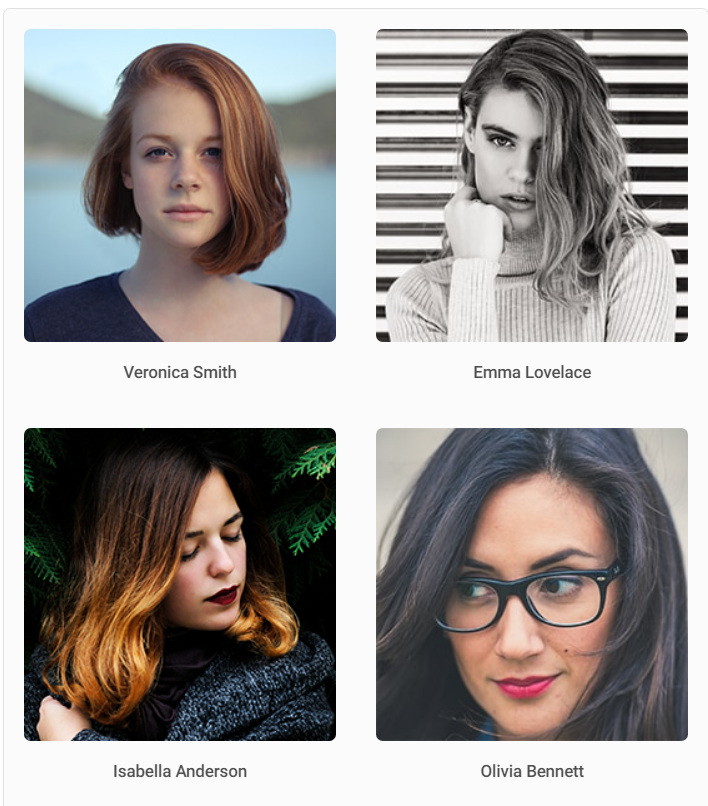
Take advantage of the law of proximity: DON'T :(
Proximity helps to establish a relationship between objects in the interface. If the distance between UI elements is ambiguous, it will cause user confusion.
In the example below, it's hard to tell at first glance which name is assigned to which photo.
Take advantage of the law of proximity: DO :)
Closeness aids users in swiftly comprehending and structuring information with greater efficiency. Objects situated nearby are interpreted as having comparable functions or characteristics.
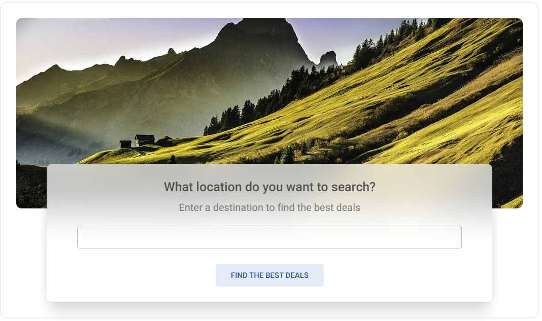
Provide default option: DON'T :(
Don't make your users' lives harder than it needs to be. Every extra action you require increases the user's mental effort and lowers the UI experience.
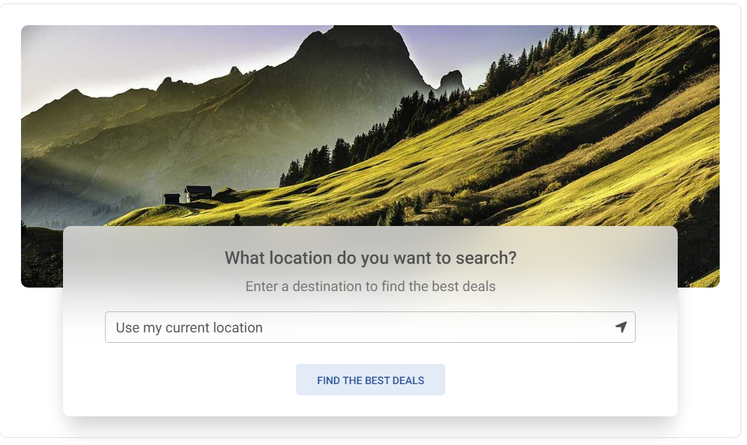
Provide default option: DO :)
Always provide a default option in your UI whenever possible. In many cases, this will coincide with the preferences of the user who will appreciate such help.
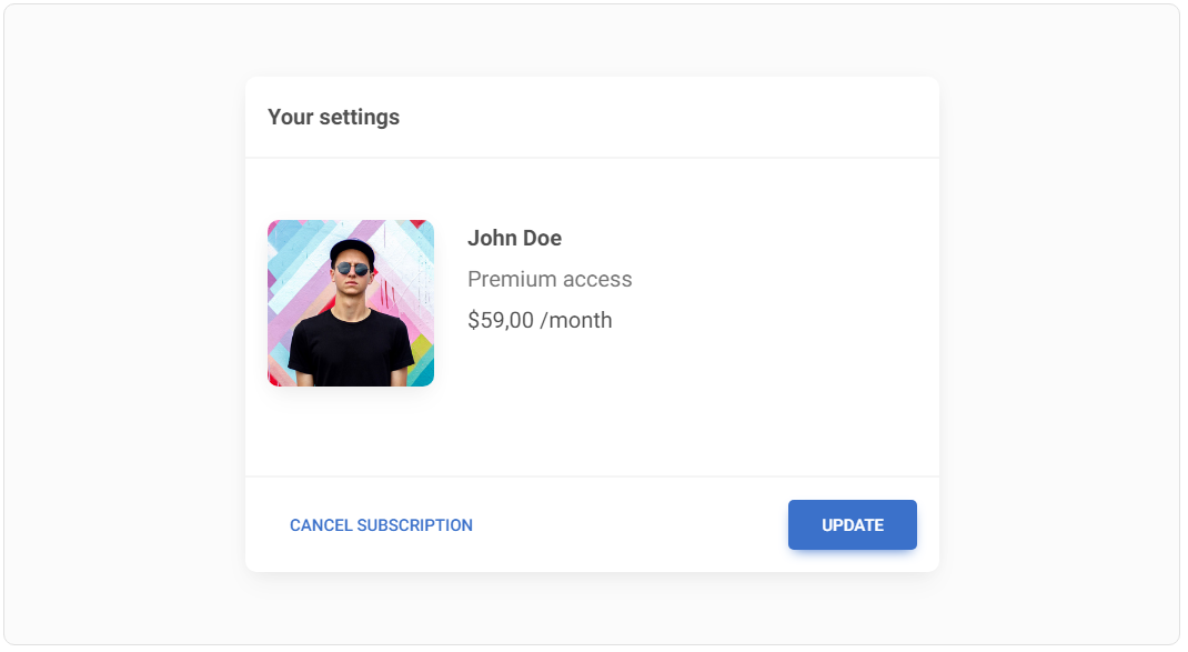
Watch out for destructive actions: DON'T :(
Red color is associated with danger. In UI design, it is customary that destructive actions in the interface, such as "delete", "cancel", etc., are marked with red color.
Bootstrap contributed a lot to this, where the .btn-danger class creates a big red button.
However, this is not the best approach, because few things attract the user's attention as much as a big red button. And do we really want the unsubscribe or delete account buttons to stand out the most from the entire interface? Definitely not.
Watch out for destructive actions: DO :)
Destructive action elements should still be easy to find in the UI, but with the big red button, not even the primary button can compete. Therefore, it is definitely better to lower their visibility so that they do not compete for attention with primary actions.
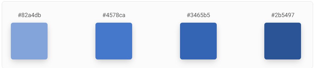
Use HSL instead of HEX or RGB colours: DON'T :(
It's hard to customize your colour palette using HEX or RGB formats because their codes are not easily interpreted by a human. So if you want to create a perfectly matched set of colours, using these formats you make your task harder.
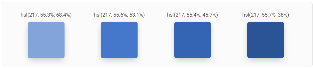
Use HSL instead of HEX or RGB colours: DO :)
It's much easier with HSL colours.
/* Syntax: hsl(hue, saturation, lightness) */
background-color: hsl(120, 100%, 50%); /* Fully saturated green color */
HSL separates the colour dimensions in a way that's more intuitive for human perception. Hue represents the colour itself, Saturation controls the intensity or purity of the colour, and Lightness adjusts the brightness. This makes it easier to mentally envision and control the colour you want.
When you adjust the Hue value in HSL, you're changing the actual colour while maintaining its brightness and saturation. This is especially useful when exploring colour schemes or making small variations to find the right tone.
When you adjust the Lightness value in HSL, you can make a colour lighter or darker without dramatically altering its hue or saturation. In RGB, changing brightness requires adjusting all three values, which can lead to unexpected colour shifts.
HSL makes it easier to create harmonious colour schemes.
Next part - As hard as it is to believe, the 28th (sic!) part of this tutorial is the last one :) But don't worry, we will have some more guides and tutorials coming soon, maybe something on Bootstrap or Tailwind CSS? We'll see.
Material Minimal, which is basically Material Design on steroids can be found here on Figma.
Material Design for Bootstrap is a UI Kit, that uses Material Minimal, check it out here.
And TW Elements, our newest child is based on Tailwind CSS. Check it out


