WebDesign Tutorial - The art of prioritization
Material Minimal - Design less, impact more
This is part seven. You can find the sixth part, The power of visual hierarchy, here
The art of prioritization
As designers, we often have a very personal approach to the projects we create. It's quite normal. However, the problem comes when we get too emotional and lose our objectivity.
In such situations, when creating an interface, we start to think that each element is equally important.
If, for example, we spent a lot of time polishing some secondary button with barely additional information, it's hard for us to accept that the user may not even pay attention to it.
"How can that be? Ignore our "baby"?! I will not allow it! I need to get THIS button to catch everyone's attention!"
We wrongly assume that the user will approach our UI with great enthusiasm and will want to spend an unlimited amount of time with it, thoroughly exploring every, even the smallest, detail designed by us.
And that's when we start emphasizing too many elements in our UI, which inevitably leads to cognitive overload of the user and ultimately to a worse user experience.
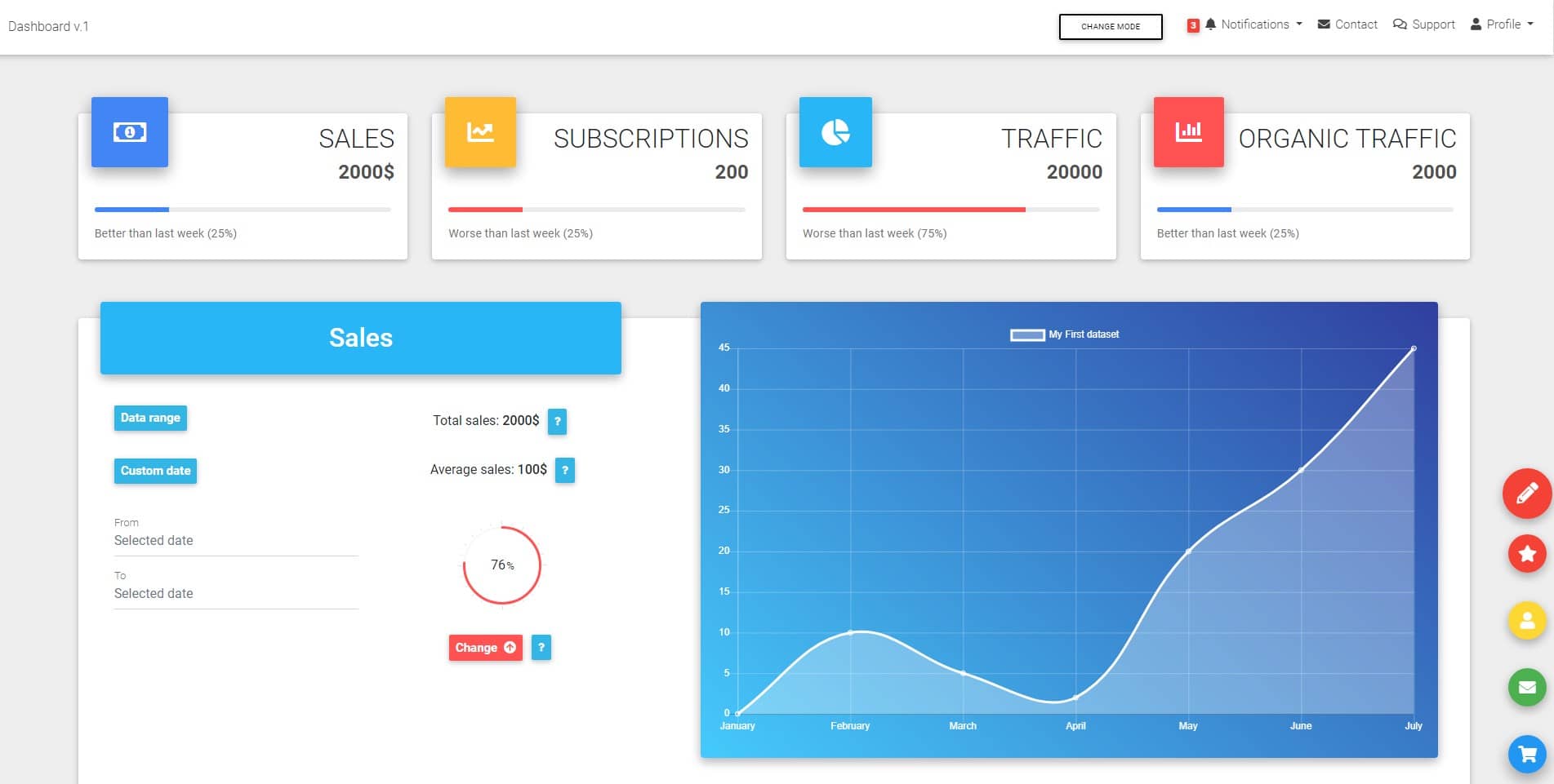
How do you feel looking at the dashboard below?

In fact, what is the most important element here? So many intense colors, so many expressive components, so many words screaming for attention.
In my opinion, this dashboard is like a rainbow. A rainbow can be beautiful, but you can't say that one color is more important than the other 6. There is no visual hierarchy in a rainbow and it's hard to get practical information out of it.
So don't let your interfaces be like a rainbow.
Yet another hard to accept truth
The hard to accept truth is that most often the user does not care about our design and only wants to find the content / information that interests him as soon as possible.
Everything that brings him closer to this goal he considers "good", and everything that hinders him "bad".
He's not going to spend more time in our interface than necessary. So we really only have a moment to catch his attention and help him find what he wants.
That's why we have to be very careful in choosing what to emphasize, deliberately reducing the weight of everything around it.
In short - we need to learn the art of prioritization in UI design to be able to create a clear visual hierarchy.
Practical tip with an example

Next part - De-emphasize with no mercy
Material Minimal, which is basically Material Design on steroids can be found here on Figma.
Material Design for Bootstrap is a UI Kit, that uses Material Minimal, check it out here.
And TW Elements, our newest child is based on Tailwind CSS. Check it out!
