WebDesign Tutorial - Let it breathe
Material Minimal - Design less, impact more
This is part 13. You can find the part 12, Beyond borders, here
Let it breathe
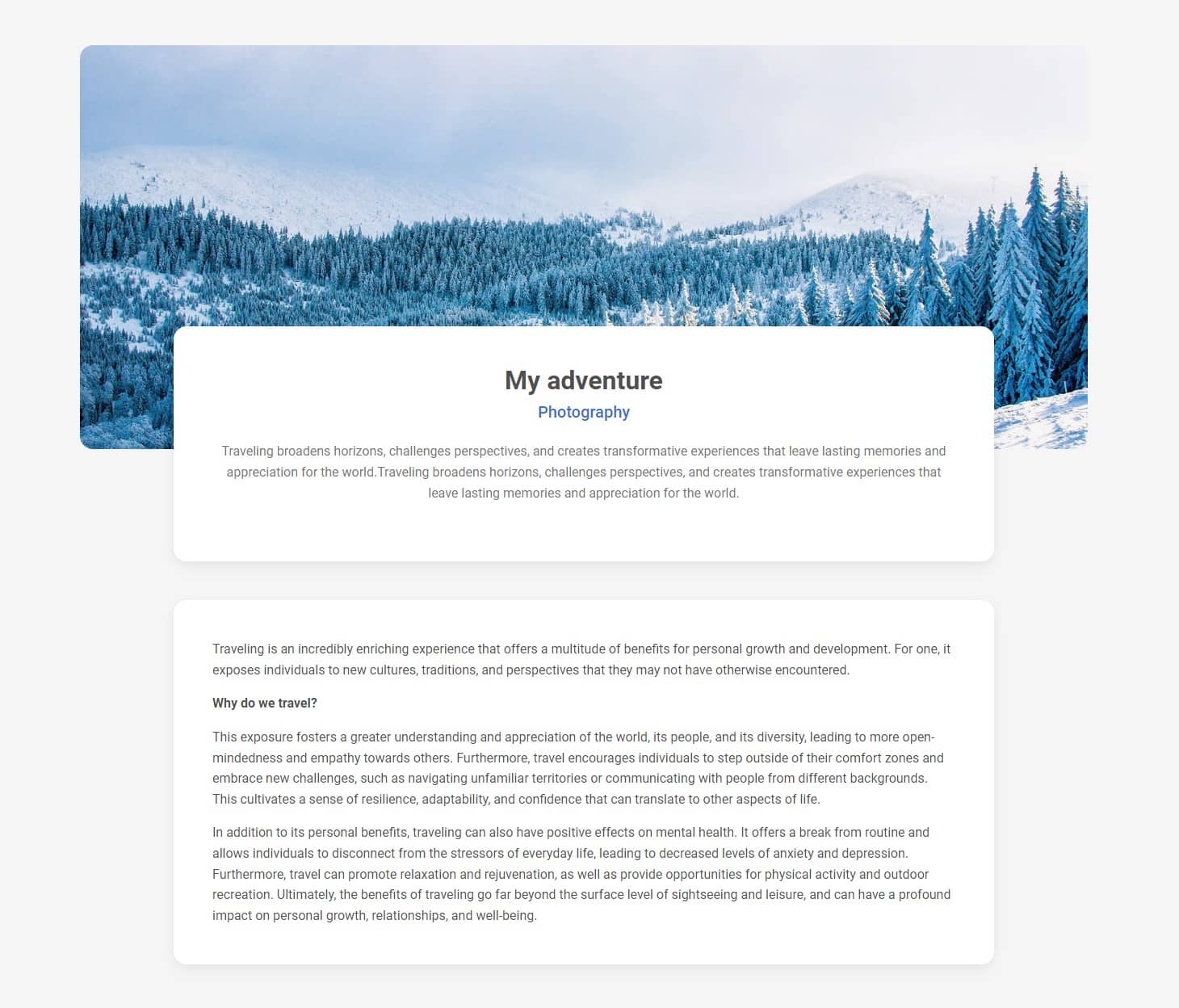
Remember from the previous lesson, when modifying the card, we removed the dividers between the list items and added more white space instead?

We couldn't go from "I need some air! 😫" to "Ahh what a relief 😌" if we just removed the borders.
We needed a white space!
Ahh white space. I could write poems about it. "Ode to white space" would describe all the deep feelings I have for this emptiness in web design.
It's essential in Material Minimal and actually, in all minimalist design, no matter if it's a digital or a physical world.
But what exactly white space is?
White space, often referred to as negative space, is a fundamental principle of UI design that involves intentionally leaving areas of a web page blank or uncluttered. While it may seem counterintuitive, white space is a powerful tool that can greatly enhance the user experience and visual appeal of a website.
***Psst!***Here is a secret - white space doesn't have to be white.
White space in the service of hierarchy
White space is also extremely helpful for visual hierarchy. It forces you, as a designer, to reduce the number of elements in the user's visual field, so that less things compete for his attention.
And the fewer things fighting for attention, the more primary elements can shine.
Take a look at the MDBootstrap.com homepage, which makes heavy use of white space, especially between sections.
In the realm of White Space, content can really be a king
White space provides breathing room for content, allowing it to stand out and be easily digestible. By strategically placing elements with ample space around them, we can create a sense of focus and hierarchy. This improves readability and comprehension, guiding users through the information presented on the page.
When I'm reading an article, I just love it when it's only me and the text, with no distracting navigation elements, suggested content, ads, or (let them burn in hell 🔥) pop-ups.

Furthermore, white space promotes a sense of elegance and sophistication. It gives a website a clean and uncluttered appearance, making it visually appealing and modern. By embracing simplicity, white space fosters a sense of calm and allows users to focus on the essential elements without distractions.
White space is low-hanging fruit
Adding white space is the easiest and quickest way to enhance the aesthetics. Why not take advantage of it?

No problem. A little white space here and there and you immediately want to dive into the content.

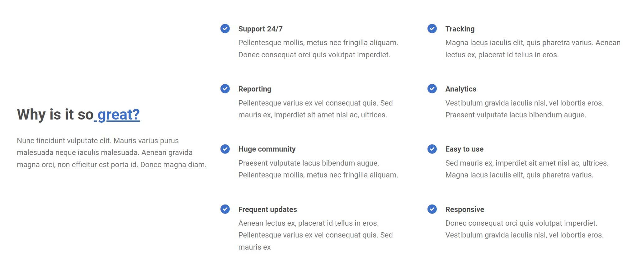
A list of features so densely spotted that the user instinctively and disgustedly skips the entire section?

Well, what would you say if we used the magic of white space and added some slack to this design?

Relief for mobile devices
What's more, white space contributes to improved mobile browsing experiences. With the rise of mobile devices, responsive design has become crucial. White space can help make a website more mobile-friendly by ensuring that content is properly spaced and easily readable on smaller screens. It allows for more comfortable touch interactions and reduces the risk of accidental taps.

In conclusion, white space is not just empty space; it is a design element with tremendous impact. By embracing white space in web design, we can create visually pleasing, easy-to-navigate, and engaging projects. The intentional use of white space enhances readability, organization, and overall user experience, making it an indispensable tool for any designer.
Next part - User experience
Material Minimal, which is basically Material Design on steroids can be found here on Figma.
Material Design for Bootstrap is a UI Kit, that uses Material Minimal, check it out here.
And TW Elements, our newest child is based on Tailwind CSS. Check it out!
