WebDesign Tutorial - Don't start with the roof
Material Minimal - Design less, impact more
This is part 15. You can find the part 14, User experience, here
Don't start with the roof
As designers, we have an unending appetite for aesthetics. We marvel at beautiful, innovative designs and get inspired to create our own. However, in the process of chasing beauty, we must not lose sight of a fundamental principle that is as valid for building a house as it is for designing interfaces: "Don't start with the roof."
This phrase is more than a cautionary note; it's a reminder of how essential it is to establish a solid foundation before tackling the more intricate aspects of a design.
If you start working on a project by choosing a color palette, thinking about eye-catching animations or searching through dozens of collections of icons to choose the most stylish ones - then stop immediately.
Don't get stuck on the details
It's very typical - we start a project and countless thoughts run through our head about various elements of it, for example, the search box in the navigation.

Our mind can easily grab onto such a thought and get stuck on it. So we start to wonder:
Should I put an icon next to the search input?
Should I use a dropdown or maybe a modal?
Should the first result be highlighted after a search?
You can spend hours thinking about it and then hours implementing it.
The problem is that our example Blog project might not even need a search box.
An even bigger problem may be that when we spend so much time preparing this search box, we will fall into the Sunk Cost Trap and for nothing in the world we will not want to admit to ourselves or to the client that we have lost time.
The Sunk Cost Trap, or Sunk Cost Fallacy, refers to the flawed decision-making process where individuals or businesses continue a behaviour or venture based on previously invested resources—such as time, money, or effort—that cannot be recovered, rather than evaluating potential future returns. This can lead to situations where people persist in unproductive activities or companies continue funding failing projects simply to justify past investments.
We will rationalize and waste even more time convincing ourselves and others that without the search box this blog absolutely cannot function.
This is obviously ridiculous, because with so little content on such a newly created blog, the existence of a search engine is simply unnecessary. Not only that - in addition to the additional time and costs associated with the implementation of such a functionality, there are also the costs of its maintenance. Believe me, it won't make your client happier.
This is why we should stay away from details at the beginning of the design process.
We should be especially mindful and as soon as our thoughts attach to details (i.e. the proverbial roof) we should catch it and focus the mind back to the foundations.
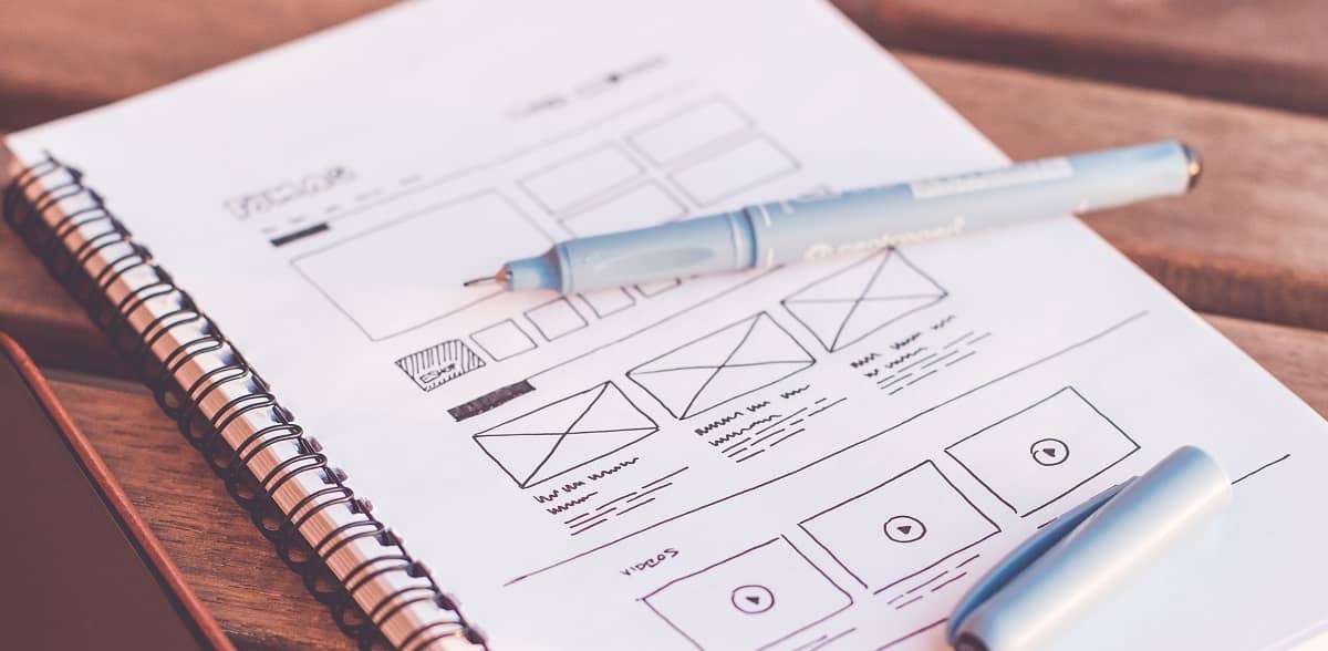
Draw on paper
There is one simple way to protect yourself from falling into the detail trap:
- Sketch the first version of the planned interface on paper (yes, I mean physical, old-school paper and pencil).
It's best if you use a relatively small piece of paper and a fairly thick, soft pencil.

Why?
On a piece of paper, you simply cannot sketch out many details, much less reflect the digital interactions of the interface, such as animations.
So you are not able to get lost in the design of the proverbial roof and you are forced to focus on the foundations.
But what exactly are these foundations and how do you go about them?
This is what we will talk about in the next lessons.
Next part - Answering Primary Questions
Material Minimal, which is basically Material Design on steroids can be found here on Figma.
Material Design for Bootstrap is a UI Kit, that uses Material Minimal, check it out here.
And TW Elements, our newest child is based on Tailwind CSS. Check it out!
