


In previous lessons, we learned a lot about preparing the environment, configuration, and deployment. All this is very important, but it's time for us to finally get a taste of Tailwind and TW Elements.
Let's jump in to the code! 🚀
Step 1 - launch the project
We will use the MDB GO starter project we worked on in the previous lesson.
If you don't already have it running, open a terminal, navigate to the directory where you have your project and enter the following command:
npm start
After entering the above command, MDB GO should start a local server on your computer and launch a browser window with your project.
Step 2 - clean the project
Remove all the code from the src/js/index.js file and also remove the carousel from index.html.
You can also remove the class dark:bg-neutral-800 from the <body> element and class dark from the <html> element.
After all the cleaning your src/js/index.js should be completely empty and index.html should look like this:
<!DOCTYPE html>
<html lang="en">
  <head>
    <meta charset="UTF-8" />
    <meta
      name="viewport"
      content="width=device-width, initial-scale=1, shrink-to-fit=no" />
    <meta http-equiv="x-ua-compatible" content="ie=edge" />
    <title>TE Vite Starter</title>
    <!-- Favicon -->
    <link
      rel="icon"
      href="https://tecdn.b-cdn.net/img/Marketing/general/logo/small/te.ico"
      type="image/x-icon" />
    <!-- Roboto font -->
    <link
      href="https://fonts.googleapis.com/css?family=Roboto:300,400,500,700,900&display=swap"
      rel="stylesheet" />
    <!-- Main css file -->
    <link rel="stylesheet" href="src/scss/index.scss" />
    <!-- Custom styles -->
    <style></style>
  </head>

  <body>
    <!-- Start your project here-->

    <!-- End your project here-->

    <!-- Main js file -->
    <script type="module" src="src/js/index.js"></script>
    <!-- Custom scripts -->
    <script type="text/javascript"></script>
  </body>
</html>
Step 3 - add navigation bar
Note 1: Take this lesson as a demonstration and don't worry if not everything is clear to you. Each aspect covered here will be explained in detail in future lessons.
Go to the navbar documentation page and locate the section "Basic" at the very beginning of that page. Click "show code" and copy HTML code.
<!-- Main navigation container -->
<nav
  class="flex-no-wrap relative flex w-full items-center justify-between bg-neutral-100 py-2 shadow-md shadow-black/5 dark:bg-neutral-600 dark:shadow-black/10 lg:flex-wrap lg:justify-start lg:py-4"
  data-twe-navbar-ref>
  <div class="flex w-full flex-wrap items-center justify-between px-3">
    <!-- Hamburger button for mobile view -->
    <button
      class="block border-0 bg-transparent px-2 text-neutral-500 hover:no-underline hover:shadow-none focus:no-underline focus:shadow-none focus:outline-none focus:ring-0 dark:text-neutral-200 lg:hidden"
      type="button"
      data-twe-collapse-init
      data-twe-target="#navbarSupportedContent1"
      aria-controls="navbarSupportedContent1"
      aria-expanded="false"
      aria-label="Toggle navigation">
      <!-- Hamburger icon -->
      <span class="[&>svg]:w-7">
        <svg
          xmlns="http://www.w3.org/2000/svg"
          viewBox="0 0 24 24"
          fill="currentColor"
          class="h-7 w-7">
          <path
            fill-rule="evenodd"
            d="M3 6.75A.75.75 0 013.75 6h16.5a.75.75 0 010 1.5H3.75A.75.75 0 013 6.75zM3 12a.75.75 0 01.75-.75h16.5a.75.75 0 010 1.5H3.75A.75.75 0 013 12zm0 5.25a.75.75 0 01.75-.75h16.5a.75.75 0 010 1.5H3.75a.75.75 0 01-.75-.75z"
            clip-rule="evenodd" />
        </svg>
      </span>
    </button>

    <!-- Collapsible navigation container -->
    <div
      class="!visible hidden flex-grow basis-[100%] items-center lg:!flex lg:basis-auto"
      id="navbarSupportedContent1"
      data-twe-collapse-item>
      <!-- Logo -->
      <a
        class="mb-4 mr-2 mt-3 flex items-center text-neutral-900 hover:text-neutral-900 focus:text-neutral-900 dark:text-neutral-200 dark:hover:text-neutral-400 dark:focus:text-neutral-400 lg:mb-0 lg:mt-0"
        href="#">
        <img
          src="https://tecdn.b-cdn.net/img/logo/te-transparent-noshadows.webp"
          style="height: 15px"
          alt=""
          loading="lazy" />
      </a>
      <!-- Left navigation links -->
      <ul
        class="list-style-none mr-auto flex flex-col pl-0 lg:flex-row"
        data-twe-navbar-nav-ref>
        <li class="mb-4 lg:mb-0 lg:pr-2" data-twe-nav-item-ref>
          <!-- Dashboard link -->
          <a
            class="text-neutral-500 hover:text-neutral-700 focus:text-neutral-700 disabled:text-black/30 dark:text-neutral-200 dark:hover:text-neutral-300 dark:focus:text-neutral-300 lg:px-2 [&.active]:text-black/90 dark:[&.active]:text-zinc-400"
            href="#"
            data-twe-nav-link-ref
            >Dashboard</a
          >
        </li>
        <!-- Team link -->
        <li class="mb-4 lg:mb-0 lg:pr-2" data-twe-nav-item-ref>
          <a
            class="text-neutral-500 hover:text-neutral-700 focus:text-neutral-700 disabled:text-black/30 dark:text-neutral-200 dark:hover:text-neutral-300 dark:focus:text-neutral-300 lg:px-2 [&.active]:text-black/90 dark:[&.active]:text-neutral-400"
            href="#"
            data-twe-nav-link-ref
            >Team</a
          >
        </li>
        <!-- Projects link -->
        <li class="mb-4 lg:mb-0 lg:pr-2" data-twe-nav-item-ref>
          <a
            class="text-neutral-500 hover:text-neutral-700 focus:text-neutral-700 disabled:text-black/30 dark:text-neutral-200 dark:hover:text-neutral-300 dark:focus:text-neutral-300 lg:px-2 [&.active]:text-black/90 dark:[&.active]:text-neutral-400"
            href="#"
            data-twe-nav-link-ref
            >Projects</a
          >
        </li>
      </ul>
    </div>

    <!-- Right elements -->
    <div class="relative flex items-center">
      <!-- Cart Icon -->
      <a
        class="mr-4 text-neutral-500 hover:text-neutral-700 focus:text-neutral-700 disabled:text-black/30 dark:text-neutral-200 dark:hover:text-neutral-300 dark:focus:text-neutral-300 [&.active]:text-black/90 dark:[&.active]:text-neutral-400"
        href="#">
        <span class="[&>svg]:w-5">
          <svg
            xmlns="http://www.w3.org/2000/svg"
            viewBox="0 0 24 24"
            fill="currentColor"
            class="h-5 w-5">
            <path
              d="M2.25 2.25a.75.75 0 000 1.5h1.386c.17 0 .318.114.362.278l2.558 9.592a3.752 3.752 0 00-2.806 3.63c0 .414.336.75.75.75h15.75a.75.75 0 000-1.5H5.378A2.25 2.25 0 017.5 15h11.218a.75.75 0 00.674-.421 60.358 60.358 0 002.96-7.228.75.75 0 00-.525-.965A60.864 60.864 0 005.68 4.509l-.232-.867A1.875 1.875 0 003.636 2.25H2.25zM3.75 20.25a1.5 1.5 0 113 0 1.5 1.5 0 01-3 0zM16.5 20.25a1.5 1.5 0 113 0 1.5 1.5 0 01-3 0z" />
          </svg>
        </span>
      </a>

      <!-- Container with two dropdown menus -->
      <div class="relative" data-twe-dropdown-ref>
        <!-- First dropdown trigger -->
        <a
          class="hidden-arrow mr-4 flex items-center text-neutral-500 hover:text-neutral-700 focus:text-neutral-700 disabled:text-black/30 dark:text-neutral-200 dark:hover:text-neutral-300 dark:focus:text-neutral-300 [&.active]:text-black/90 dark:[&.active]:text-neutral-400"
          href="#"
          id="dropdownMenuButton1"
          role="button"
          data-twe-dropdown-toggle-ref
          aria-expanded="false">
          <!-- Dropdown trigger icon -->
          <span class="[&>svg]:w-5">
            <svg
              xmlns="http://www.w3.org/2000/svg"
              viewBox="0 0 24 24"
              fill="currentColor"
              class="h-5 w-5">
              <path
                fill-rule="evenodd"
                d="M5.25 9a6.75 6.75 0 0113.5 0v.75c0 2.123.8 4.057 2.118 5.52a.75.75 0 01-.297 1.206c-1.544.57-3.16.99-4.831 1.243a3.75 3.75 0 11-7.48 0 24.585 24.585 0 01-4.831-1.244.75.75 0 01-.298-1.205A8.217 8.217 0 005.25 9.75V9zm4.502 8.9a2.25 2.25 0 104.496 0 25.057 25.057 0 01-4.496 0z"
                clip-rule="evenodd" />
            </svg>
          </span>
          <!-- Notification counter -->
          <span
            class="absolute -mt-2.5 ml-2 rounded-[0.37rem] bg-danger px-[0.45em] py-[0.2em] text-[0.6rem] leading-none text-white"
            >1</span
          >
        </a>
        <!-- First dropdown menu -->
        <ul
          class="absolute left-auto right-0 z-[1000] float-left m-0 mt-1 hidden min-w-max list-none overflow-hidden rounded-lg border-none bg-white bg-clip-padding text-left text-base shadow-lg data-[twe-dropdown-show]:block dark:bg-neutral-700"
          aria-labelledby="dropdownMenuButton1"
          data-twe-dropdown-menu-ref>
          <!-- First dropdown menu items -->
          <li>
            <a
              class="block w-full whitespace-nowrap bg-transparent px-4 py-2 text-sm font-normal text-neutral-700 hover:bg-neutral-100 active:text-neutral-800 active:no-underline disabled:pointer-events-none disabled:bg-transparent disabled:text-neutral-400 dark:text-neutral-200 dark:hover:bg-white/30"
              href="#"
              data-twe-dropdown-item-ref
              >Action</a
            >
          </li>
          <li>
            <a
              class="block w-full whitespace-nowrap bg-transparent px-4 py-2 text-sm font-normal text-neutral-700 hover:bg-neutral-100 active:text-neutral-800 active:no-underline disabled:pointer-events-none disabled:bg-transparent disabled:text-neutral-400 dark:text-neutral-200 dark:hover:bg-white/30"
              href="#"
              data-twe-dropdown-item-ref
              >Another action</a
            >
          </li>
          <li>
            <a
              class="block w-full whitespace-nowrap bg-transparent px-4 py-2 text-sm font-normal text-neutral-700 hover:bg-neutral-100 active:text-neutral-800 active:no-underline disabled:pointer-events-none disabled:bg-transparent disabled:text-neutral-400 dark:text-neutral-200 dark:hover:bg-white/30"
              href="#"
              data-twe-dropdown-item-ref
              >Something else here</a
            >
          </li>
        </ul>
      </div>

      <!-- Second dropdown container -->
      <div class="relative" data-twe-dropdown-ref>
        <!-- Second dropdown trigger -->
        <a
          class="hidden-arrow flex items-center whitespace-nowrap transition duration-150 ease-in-out motion-reduce:transition-none"
          href="#"
          id="dropdownMenuButton2"
          role="button"
          data-twe-dropdown-toggle-ref
          aria-expanded="false">
          <!-- User avatar -->
          <img
            src="https://tecdn.b-cdn.net/img/new/avatars/2.jpg"
            class="rounded-full"
            style="height: 25px; width: 25px"
            alt=""
            loading="lazy" />
        </a>
        <!-- Second dropdown menu -->
        <ul
          class="absolute left-auto right-0 z-[1000] float-left m-0 mt-1 hidden min-w-max list-none overflow-hidden rounded-lg border-none bg-white bg-clip-padding text-left text-base shadow-lg data-[twe-dropdown-show]:block dark:bg-neutral-700"
          aria-labelledby="dropdownMenuButton2"
          data-twe-dropdown-menu-ref>
          <!-- Second dropdown menu items -->
          <li>
            <a
              class="block w-full whitespace-nowrap bg-transparent px-4 py-2 text-sm font-normal text-neutral-700 hover:bg-neutral-100 active:text-neutral-800 active:no-underline disabled:pointer-events-none disabled:bg-transparent disabled:text-neutral-400 dark:text-neutral-200 dark:hover:bg-white/30"
              href="#"
              data-twe-dropdown-item-ref
              >Action</a
            >
          </li>
          <li>
            <a
              class="block w-full whitespace-nowrap bg-transparent px-4 py-2 text-sm font-normal text-neutral-700 hover:bg-neutral-100 active:text-neutral-800 active:no-underline disabled:pointer-events-none disabled:bg-transparent disabled:text-neutral-400 dark:text-neutral-200 dark:hover:bg-white/30"
              href="#"
              data-twe-dropdown-item-ref
              >Another action</a
            >
          </li>
          <li>
            <a
              class="block w-full whitespace-nowrap bg-transparent px-4 py-2 text-sm font-normal text-neutral-700 hover:bg-neutral-100 active:text-neutral-800 active:no-underline disabled:pointer-events-none disabled:bg-transparent disabled:text-neutral-400 dark:text-neutral-200 dark:hover:bg-white/30"
              href="#"
              data-twe-dropdown-item-ref
              >Something else here</a
            >
          </li>
        </ul>
      </div>
    </div>
  </div>
</nav
Then paste it into the index.html file and save it. After refreshing the browser you should see a nice, interactive navigation bar.
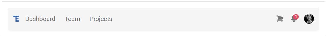
As you can see, there are a lot of different classes in such a single component. This looks like a mess at first glance, but that's the nature of Tailwind CSS and the utility-first approach. You will soon learn the advantages of this and find out what benefits we have in return for this chaos.
As this is a demo lesson, we won't go into what exactly these classes do at this point. We'll cover each of these in detail in future lessons, but for now let's focus on finishing our first page.
Changing the color
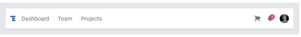
But there is one little thing I would like us to change - the color of the navbar.
Locate the bg-neutral-100 class in the navbar (it gives the navbar a gray color) and replace it with bg-white class.
In my opinion it's much nicer then.
Navbar initialization
Our navbar looks good, but unfortunately it doesn't work properly yet. If you reduce the size of the browser window to the mobile size and click on the hamburger icon, you will see that the menu does not expand.
This is because we still need to initialize the component.
So again, go to the navbar documentation page and from the basic example click the "JavaScript" tab and copy the initialization code.
Then paste it to the src/js/index.js file:
// Initialization for ES Users import { Collapse, Dropdown, initTWE, } from
"tw-elements"; initTWE({ Collapse, Dropdown });
After saving the file you should see all the interactive elements (like hamburger or dropdown) work properly.
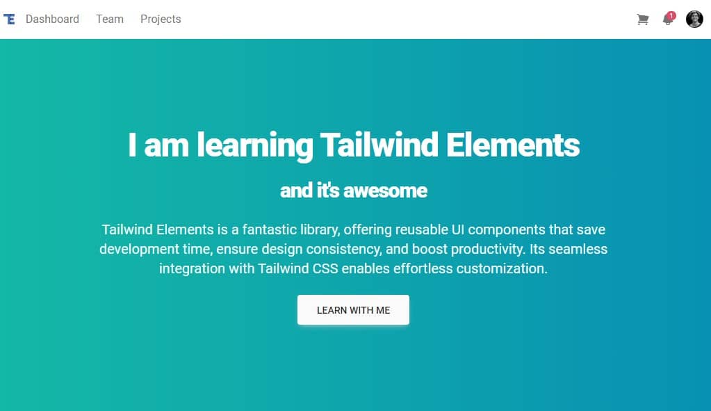
Step 4 - add jumbotron
It would be good to add some element that would stand out from the start.
Such an element may be a jumbotron, which is commonly understood as a banner with information crucial for our website.
Directly under the navbar, add the following code:
<!-- Jumbotron -->
<div
  class="relative mb-16 flex items-center justify-center bg-gray-50 py-16 sm:py-24 lg:py-32">
  <div
    class="absolute inset-0 bg-gradient-to-r from-teal-500 to-cyan-600 dark:from-neutral-700 dark:to-neutral-800"
    aria-hidden="true"></div>
  <div class="relative px-4 sm:px-6 lg:px-8">
    <div class="mx-auto max-w-4xl text-center text-lg">
      <h1
        class="text-4xl font-extrabold tracking-tight text-white sm:text-4xl lg:text-5xl">
        <span class="mb-6 block">I am learning TW Elements</span>
        <span class="block text-3xl">and it's awesome</span>
      </h1>
      <p class="mb-6 mt-6 max-w-3xl text-xl text-teal-50">
        TW Elements is a fantastic library, offering reusable UI components
        that save development time, ensure design consistency, and boost
        productivity. Its seamless integration with Tailwind CSS enables
        effortless customization.
      </p>

      <a
        role="button"
        href="https://tw-elements.com/learn/te-foundations/basics/introduction/"
        target="_blank"
        class="inline-block rounded bg-neutral-50 px-7 pb-2.5 pt-3 text-sm font-medium uppercase leading-normal text-neutral-800 shadow-[0_4px_9px_-4px_#cbcbcb] transition duration-150 ease-in-out hover:bg-neutral-100 hover:shadow-[0_8px_9px_-4px_rgba(203,203,203,0.3),0_4px_18px_0_rgba(203,203,203,0.2)] focus:bg-neutral-100 focus:shadow-[0_8px_9px_-4px_rgba(203,203,203,0.3),0_4px_18px_0_rgba(203,203,203,0.2)] focus:outline-none focus:ring-0 active:bg-neutral-200 active:shadow-[0_8px_9px_-4px_rgba(203,203,203,0.3),0_4px_18px_0_rgba(203,203,203,0.2)] dark:shadow-[0_4px_9px_-4px_rgba(251,251,251,0.3)] dark:hover:shadow-[0_8px_9px_-4px_rgba(251,251,251,0.1),0_4px_18px_0_rgba(251,251,251,0.05)] dark:focus:shadow-[0_8px_9px_-4px_rgba(251,251,251,0.1),0_4px_18px_0_rgba(251,251,251,0.05)] dark:active:shadow-[0_8px_9px_-4px_rgba(251,251,251,0.1),0_4px_18px_0_rgba(251,251,251,0.05)]">
        Learn with me
      </a>
    </div>
  </div>
</div>
After saving the file you should see a pretty, gradient jumbotron.
Step 5 - add grid
There is a very nice component called a card. Cards are not only visually attractive, but also great for presenting various types of content.

Card title
Some quick example text to build on the card title and make up the bulk of the card's content.
BUTTON
Wouldn't it be great to have some nice cards like this in our design? Sure it would!
However, there is a problem - how to place them in our layout so that they display correctly on both large screens and phones? Of course, on large screens we want to have them next to each other, say 3 in a row. On the other hand, they should line up one above the other on mobile.
This is where Tailwind grid comes in handy, which is a powerful tool for creating a responsive layout.
We will learn about the grid in detail in future lessons. Now just trust me and just follow the steps given below.
Paste this grid code below the jumbotron component:
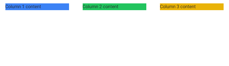
<!-- Grid -->
<div class="container mx-auto mb-16">
  <div class="grid grid-cols-1 gap-12 md:grid-cols-3">
    <!-- Column 1 -->
    <div class="bg-blue-500">Column 1 content</div>
    <!-- Column 1 -->

    <!-- Column 2 -->
    <div class="bg-green-500">Column 2 content</div>
    <!-- Column 2 -->

    <!-- Column 3 -->
    <div class="bg-yellow-500">Column 3 content</div>
    <!-- Column 3 -->
  </div>
</div>
After saving the file you should see three columns.

Responsive layout
If you start resizing the browser window, you will notice that this layout is responsive and adapts to the width of the screen - on smaller screens the columns will be placed one below the other.
Step 6 - add cards
Now we're ready to add cards.
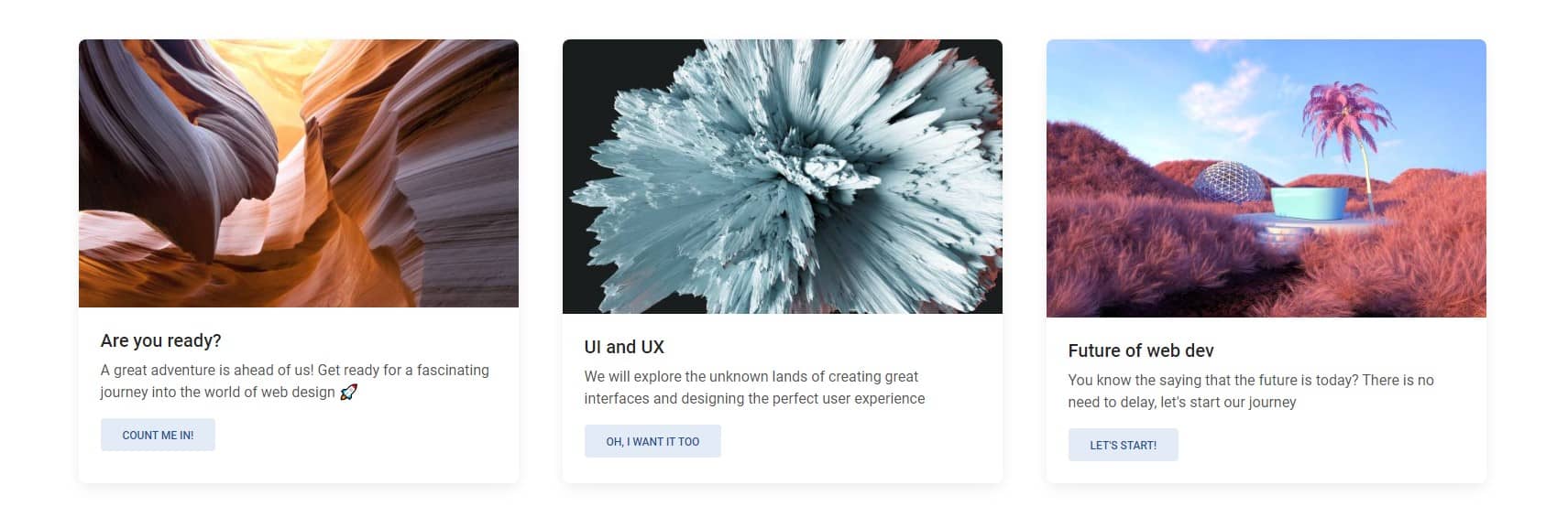
Go to the cards documentation page and copy the HTML code form the section "With ripple effect".
What is ripple? Ripple is a Material Design effect of the propagation of circular waves upon interaction with a given element. In the documentation example, click the image or the button in the card to see it.
Then paste 3 cards between <!-- Column --> comments replacing the code there with the card code (you can change the pictures and texts in the cards as you like or even customize the card elements like buttons)
<!-- Grid -->
<div class="container mx-auto">
  <div class="grid grid-cols-1 gap-12 md:grid-cols-3">
    <!-- Column 1 -->
    <div
      class="block rounded-lg bg-white shadow-[0_2px_15px_-3px_rgba(0,0,0,0.07),0_10px_20px_-2px_rgba(0,0,0,0.04)] dark:bg-neutral-700">
      <div
        class="relative overflow-hidden bg-cover bg-no-repeat"
        data-twe-ripple-init
        data-twe-ripple-color="light">
        <img
          class="rounded-t-lg"
          src="https://tecdn.b-cdn.net/img/new/textures/small/1.jpg"
          alt="" />
        <a href="#!">
          <div
            class="absolute bottom-0 left-0 right-0 top-0 h-full w-full overflow-hidden bg-[hsla(0,0%,98%,0.15)] bg-fixed opacity-0 transition duration-300 ease-in-out hover:opacity-100"></div>
        </a>
      </div>
      <div class="p-6">
        <h5
          class="mb-2 text-xl font-medium leading-tight text-neutral-800 dark:text-neutral-50">
          Are you ready?
        </h5>
        <p class="mb-4 text-base text-neutral-600 dark:text-neutral-200">
          A great adventure is ahead of us! Get ready for a fascinating
          journey into the world of web design 🚀
        </p>
        <button
          type="button"
          class="inline-block rounded bg-primary-100 px-6 pb-2 pt-2.5 text-xs font-medium uppercase leading-normal text-primary-700 transition duration-150 ease-in-out hover:bg-primary-accent-100 focus:bg-primary-accent-100 focus:outline-none focus:ring-0 active:bg-primary-accent-200">
          Count me in!
        </button>
      </div>
    </div>
    <!-- Column 1 -->

    <!-- Column 2 -->
    <div
      class="block rounded-lg bg-white shadow-[0_2px_15px_-3px_rgba(0,0,0,0.07),0_10px_20px_-2px_rgba(0,0,0,0.04)] dark:bg-neutral-700">
      <div
        class="relative overflow-hidden bg-cover bg-no-repeat"
        data-twe-ripple-init
        data-twe-ripple-color="light">
        <img
          class="rounded-t-lg"
          src="https://tecdn.b-cdn.net/img/new/textures/small/103.jpg"
          alt="" />
        <a href="#!">
          <div
            class="absolute bottom-0 left-0 right-0 top-0 h-full w-full overflow-hidden bg-[hsla(0,0%,98%,0.15)] bg-fixed opacity-0 transition duration-300 ease-in-out hover:opacity-100"></div>
        </a>
      </div>
      <div class="p-6">
        <h5
          class="mb-2 text-xl font-medium leading-tight text-neutral-800 dark:text-neutral-50">
          UI and UX
        </h5>
        <p class="mb-4 text-base text-neutral-600 dark:text-neutral-200">
          We will explore the unknown lands of creating great interfaces and
          designing the perfect user experience
        </p>
        <button
          type="button"
          class="inline-block rounded bg-primary-100 px-6 pb-2 pt-2.5 text-xs font-medium uppercase leading-normal text-primary-700 transition duration-150 ease-in-out hover:bg-primary-accent-100 focus:bg-primary-accent-100 focus:outline-none focus:ring-0 active:bg-primary-accent-200">
          Oh, I want it too
        </button>
      </div>
    </div>
    <!-- Column 2 -->

    <!-- Column 3 -->
    <div
      class="block rounded-lg bg-white shadow-[0_2px_15px_-3px_rgba(0,0,0,0.07),0_10px_20px_-2px_rgba(0,0,0,0.04)] dark:bg-neutral-700">
      <div
        class="relative overflow-hidden bg-cover bg-no-repeat"
        data-twe-ripple-init
        data-twe-ripple-color="light">
        <img
          class="rounded-t-lg"
          src="https://tecdn.b-cdn.net/img/new/textures/small/56.jpg"
          alt="" />
        <a href="#!">
          <div
            class="absolute bottom-0 left-0 right-0 top-0 h-full w-full overflow-hidden bg-[hsla(0,0%,98%,0.15)] bg-fixed opacity-0 transition duration-300 ease-in-out hover:opacity-100"></div>
        </a>
      </div>
      <div class="p-6">
        <h5
          class="mb-2 text-xl font-medium leading-tight text-neutral-800 dark:text-neutral-50">
          Future of web dev
        </h5>
        <p class="mb-4 text-base text-neutral-600 dark:text-neutral-200">
          You know the saying that the future is today? There is no need to
          delay, let's start our journey
        </p>

        <button
          type="button"
          class="inline-block rounded bg-primary-100 px-6 pb-2 pt-2.5 text-xs font-medium uppercase leading-normal text-primary-700 transition duration-150 ease-in-out hover:bg-primary-accent-100 focus:bg-primary-accent-100 focus:outline-none focus:ring-0 active:bg-primary-accent-200">
          Let's start!
        </button>
      </div>
    </div>
    <!-- Column 3 -->
  </div>
</div>
After saving the file you should see the cards:
Ripple initialization
Now when you click on the card image you won't see a ripple effect. As with the navbar, here also we need to initialize it first.
In the Card with ripple effect, when you click on JavaScript tab you will see the initialization code.
So let's update src/js/index.js file and add ripple initialization:
// Initialization for ES Users import { Collapse, Dropdown, Ripple, initTWE,
} from "tw-elements"; initTWE({ Collapse, Dropdown, Ripple });
Now when you click on the card image you will see ripple effect:

Are you ready?
A great adventure is ahead of us! Get ready for a fascinating journey into the world of web design 🚀
COUNT ME IN!
Step 7 - add footer
The final step of our small project will be adding a footer.
A footer is an additional navigation component. It can hold links, buttons, company info, copyrights, forms, and many other elements.
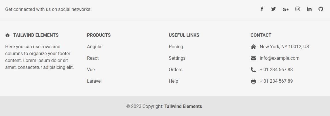
Go to the footer documentation page and copy the code of the Basic example.
Then paste it below the grid with the cards:
<!-- Footer container -->
<footer
  class="bg-neutral-100 text-center text-neutral-600 dark:bg-neutral-600 dark:text-neutral-200 lg:text-left">
  <div
    class="flex items-center justify-center border-b-2 border-neutral-200 p-6 dark:border-neutral-500 lg:justify-between">
    <div class="mr-12 hidden lg:block">
      <span>Get connected with us on social networks:</span>
    </div>
    <!-- Social network icons container -->
    <div class="flex justify-center">
      <a href="#!" class="mr-6 text-neutral-600 dark:text-neutral-200">
        <svg
          xmlns="http://www.w3.org/2000/svg"
          class="h-4 w-4"
          fill="currentColor"
          viewBox="0 0 24 24">
          <path
            d="M9 8h-3v4h3v12h5v-12h3.642l.358-4h-4v-1.667c0-.955.192-1.333 1.115-1.333h2.885v-5h-3.808c-3.596 0-5.192 1.583-5.192 4.615v3.385z" />
        </svg>
      </a>
      <a href="#!" class="mr-6 text-neutral-600 dark:text-neutral-200">
        <svg
          xmlns="http://www.w3.org/2000/svg"
          class="h-4 w-4"
          fill="currentColor"
          viewBox="0 0 24 24">
          <path
            d="M24 4.557c-.883.392-1.832.656-2.828.775 1.017-.609 1.798-1.574 2.165-2.724-.951.564-2.005.974-3.127 1.195-.897-.957-2.178-1.555-3.594-1.555-3.179 0-5.515 2.966-4.797 6.045-4.091-.205-7.719-2.165-10.148-5.144-1.29 2.213-.669 5.108 1.523 6.574-.806-.026-1.566-.247-2.229-.616-.054 2.281 1.581 4.415 3.949 4.89-.693.188-1.452.232-2.224.084.626 1.956 2.444 3.379 4.6 3.419-2.07 1.623-4.678 2.348-7.29 2.04 2.179 1.397 4.768 2.212 7.548 2.212 9.142 0 14.307-7.721 13.995-14.646.962-.695 1.797-1.562 2.457-2.549z" />
        </svg>
      </a>
      <a href="#!" class="mr-6 text-neutral-600 dark:text-neutral-200">
        <svg
          xmlns="http://www.w3.org/2000/svg"
          class="h-5 w-5"
          fill="currentColor"
          viewBox="0 0 24 24">
          <path
            d="M7 11v2.4h3.97c-.16 1.029-1.2 3.02-3.97 3.02-2.39 0-4.34-1.979-4.34-4.42 0-2.44 1.95-4.42 4.34-4.42 1.36 0 2.27.58 2.79 1.08l1.9-1.83c-1.22-1.14-2.8-1.83-4.69-1.83-3.87 0-7 3.13-7 7s3.13 7 7 7c4.04 0 6.721-2.84 6.721-6.84 0-.46-.051-.81-.111-1.16h-6.61zm0 0 17 2h-3v3h-2v-3h-3v-2h3v-3h2v3h3v2z"
            fill-rule="evenodd"
            clip-rule="evenodd" />
        </svg>
      </a>
      <a href="#!" class="mr-6 text-neutral-600 dark:text-neutral-200">
        <svg
          xmlns="http://www.w3.org/2000/svg"
          class="h-4 w-4"
          fill="currentColor"
          viewBox="0 0 24 24">
          <path
            d="M12 2.163c3.204 0 3.584.012 4.85.07 3.252.148 4.771 1.691 4.919 4.919.058 1.265.069 1.645.069 4.849 0 3.205-.012 3.584-.069 4.849-.149 3.225-1.664 4.771-4.919 4.919-1.266.058-1.644.07-4.85.07-3.204 0-3.584-.012-4.849-.07-3.26-.149-4.771-1.699-4.919-4.92-.058-1.265-.07-1.644-.07-4.849 0-3.204.013-3.583.07-4.849.149-3.227 1.664-4.771 4.919-4.919 1.266-.057 1.645-.069 4.849-.069zm0-2.163c-3.259 0-3.667.014-4.947.072-4.358.2-6.78 2.618-6.98 6.98-.059 1.281-.073 1.689-.073 4.948 0 3.259.014 3.668.072 4.948.2 4.358 2.618 6.78 6.98 6.98 1.281.058 1.689.072 4.948.072 3.259 0 3.668-.014 4.948-.072 4.354-.2 6.782-2.618 6.979-6.98.059-1.28.073-1.689.073-4.948 0-3.259-.014-3.667-.072-4.947-.196-4.354-2.617-6.78-6.979-6.98-1.281-.059-1.69-.073-4.949-.073zm0 5.838c-3.403 0-6.162 2.759-6.162 6.162s2.759 6.163 6.162 6.163 6.162-2.759 6.162-6.163c0-3.403-2.759-6.162-6.162-6.162zm0 10.162c-2.209 0-4-1.79-4-4 0-2.209 1.791-4 4-4s4 1.791 4 4c0 2.21-1.791 4-4 4zm6.406-11.845c-.796 0-1.441.645-1.441 1.44s.645 1.44 1.441 1.44c.795 0 1.439-.645 1.439-1.44s-.644-1.44-1.439-1.44z" />
        </svg>
      </a>
      <a href="#!" class="mr-6 text-neutral-600 dark:text-neutral-200">
        <svg
          xmlns="http://www.w3.org/2000/svg"
          class="h-4 w-4"
          fill="currentColor"
          viewBox="0 0 24 24">
          <path
            d="M4.98 3.5c0 1.381-1.11 2.5-2.48 2.5s-2.48-1.119-2.48-2.5c0-1.38 1.11-2.5 2.48-2.5s2.48 1.12 2.48 2.5zm.02 4.5h-5v16h5v-16zm7.982 0h-4.968v16h4.969v-8.399c0-4.67 6.029-5.052 6.029 0v8.399h4.988v-10.131c0-7.88-8.922-7.593-11.018-3.714v-2.155z" />
        </svg>
      </a>
      <a href="#!" class="text-neutral-600 dark:text-neutral-200">
        <svg
          xmlns="http://www.w3.org/2000/svg"
          class="h-4 w-4"
          fill="currentColor"
          viewBox="0 0 24 24">
          <path
            d="M12 0c-6.626 0-12 5.373-12 12 0 5.302 3.438 9.8 8.207 11.387.599.111.793-.261.793-.577v-2.234c-3.338.726-4.033-1.416-4.033-1.416-.546-1.387-1.333-1.756-1.333-1.756-1.089-.745.083-.729.083-.729 1.205.084 1.839 1.237 1.839 1.237 1.07 1.834 2.807 1.304 3.492.997.107-.775.418-1.305.762-1.604-2.665-.305-5.467-1.334-5.467-5.931 0-1.311.469-2.381 1.236-3.221-.124-.303-.535-1.524.117-3.176 0 0 1.008-.322 3.301 1.23.957-.266 1.983-.399 3.003-.404 1.02.005 2.047.138 3.006.404 2.291-1.552 3.297-1.23 3.297-1.23.653 1.653.242 2.874.118 3.176.77.84 1.235 1.911 1.235 3.221 0 4.609-2.807 5.624-5.479 5.921.43.372.823 1.102.823 2.222v3.293c0 .319.192.694.801.576 4.765-1.589 8.199-6.086 8.199-11.386 0-6.627-5.373-12-12-12z" />
        </svg>
      </a>
    </div>
  </div>

  <!-- Main container div: holds the entire content of the footer, including four sections (TW Elements, Products, Useful links, and Contact), with responsive styling and appropriate padding/margins. -->
  <div class="mx-6 py-10 text-center md:text-left">
    <div class="grid-1 grid gap-8 md:grid-cols-2 lg:grid-cols-4">
      <!-- TW Elements section -->
      <div class="">
        <h6
          class="mb-4 flex items-center justify-center font-semibold uppercase md:justify-start">
          <svg
            xmlns="http://www.w3.org/2000/svg"
            viewBox="0 0 24 24"
            fill="currentColor"
            class="mr-3 h-4 w-4">
            <path
              d="M12.378 1.602a.75.75 0 00-.756 0L3 6.632l9 5.25 9-5.25-8.622-5.03zM21.75 7.93l-9 5.25v9l8.628-5.032a.75.75 0 00.372-.648V7.93zM11.25 22.18v-9l-9-5.25v8.57a.75.75 0 00.372.648l8.628 5.033z" />
          </svg>
          TW Elements
        </h6>
        <p>
          Here you can use rows and columns to organize your footer content.
          Lorem ipsum dolor sit amet, consectetur adipisicing elit.
        </p>
      </div>
      <!-- Products section -->
      <div class="">
        <h6
          class="mb-4 flex justify-center font-semibold uppercase md:justify-start">
          Products
        </h6>
        <p class="mb-4">
          <a href="#!" class="text-neutral-600 dark:text-neutral-200"
            >Angular</a
          >
        </p>
        <p class="mb-4">
          <a href="#!" class="text-neutral-600 dark:text-neutral-200"
            >React</a
          >
        </p>
        <p class="mb-4">
          <a href="#!" class="text-neutral-600 dark:text-neutral-200"
            >Vue</a
          >
        </p>
        <p>
          <a href="#!" class="text-neutral-600 dark:text-neutral-200"
            >Laravel</a
          >
        </p>
      </div>
      <!-- Useful links section -->
      <div class="">
        <h6
          class="mb-4 flex justify-center font-semibold uppercase md:justify-start">
          Useful links
        </h6>
        <p class="mb-4">
          <a href="#!" class="text-neutral-600 dark:text-neutral-200"
            >Pricing</a
          >
        </p>
        <p class="mb-4">
          <a href="#!" class="text-neutral-600 dark:text-neutral-200"
            >Settings</a
          >
        </p>
        <p class="mb-4">
          <a href="#!" class="text-neutral-600 dark:text-neutral-200"
            >Orders</a
          >
        </p>
        <p>
          <a href="#!" class="text-neutral-600 dark:text-neutral-200"
            >Help</a
          >
        </p>
      </div>
      <!-- Contact section -->
      <div>
        <h6
          class="mb-4 flex justify-center font-semibold uppercase md:justify-start">
          Contact
        </h6>
        <p class="mb-4 flex items-center justify-center md:justify-start">
          <svg
            xmlns="http://www.w3.org/2000/svg"
            viewBox="0 0 24 24"
            fill="currentColor"
            class="mr-3 h-5 w-5">
            <path
              d="M11.47 3.84a.75.75 0 011.06 0l8.69 8.69a.75.75 0 101.06-1.06l-8.689-8.69a2.25 2.25 0 00-3.182 0l-8.69 8.69a.75.75 0 001.061 1.06l8.69-8.69z" />
            <path
              d="M12 5.432l8.159 8.159c.03.03.06.058.091.086v6.198c0 1.035-.84 1.875-1.875 1.875H15a.75.75 0 01-.75-.75v-4.5a.75.75 0 00-.75-.75h-3a.75.75 0 00-.75.75V21a.75.75 0 01-.75.75H5.625a1.875 1.875 0 01-1.875-1.875v-6.198a2.29 2.29 0 00.091-.086L12 5.43z" />
          </svg>
          New York, NY 10012, US
        </p>
        <p class="mb-4 flex items-center justify-center md:justify-start">
          <svg
            xmlns="http://www.w3.org/2000/svg"
            viewBox="0 0 24 24"
            fill="currentColor"
            class="mr-3 h-5 w-5">
            <path
              d="M1.5 8.67v8.58a3 3 0 003 3h15a3 3 0 003-3V8.67l-8.928 5.493a3 3 0 01-3.144 0L1.5 8.67z" />
            <path
              d="M22.5 6.908V6.75a3 3 0 00-3-3h-15a3 3 0 00-3 3v.158l9.714 5.978a1.5 1.5 0 001.572 0L22.5 6.908z" />
          </svg>
          info@example.com
        </p>
        <p class="mb-4 flex items-center justify-center md:justify-start">
          <svg
            xmlns="http://www.w3.org/2000/svg"
            viewBox="0 0 24 24"
            fill="currentColor"
            class="mr-3 h-5 w-5">
            <path
              fill-rule="evenodd"
              d="M1.5 4.5a3 3 0 013-3h1.372c.86 0 1.61.586 1.819 1.42l1.105 4.423a1.875 1.875 0 01-.694 1.955l-1.293.97c-.135.101-.164.249-.126.352a11.285 11.285 0 006.697 6.697c.103.038.25.009.352-.126l.97-1.293a1.875 1.875 0 011.955-.694l4.423 1.105c.834.209 1.42.959 1.42 1.82V19.5a3 3 0 01-3 3h-2.25C8.552 22.5 1.5 15.448 1.5 6.75V4.5z"
              clip-rule="evenodd" />
          </svg>
          + 01 234 567 88
        </p>
        <p class="flex items-center justify-center md:justify-start">
          <svg
            xmlns="http://www.w3.org/2000/svg"
            viewBox="0 0 24 24"
            fill="currentColor"
            class="mr-3 h-5 w-5">
            <path
              fill-rule="evenodd"
              d="M7.875 1.5C6.839 1.5 6 2.34 6 3.375v2.99c-.426.053-.851.11-1.274.174-1.454.218-2.476 1.483-2.476 2.917v6.294a3 3 0 003 3h.27l-.155 1.705A1.875 1.875 0 007.232 22.5h9.536a1.875 1.875 0 001.867-2.045l-.155-1.705h.27a3 3 0 003-3V9.456c0-1.434-1.022-2.7-2.476-2.917A48.716 48.716 0 0018 6.366V3.375c0-1.036-.84-1.875-1.875-1.875h-8.25zM16.5 6.205v-2.83A.375.375 0 0016.125 3h-8.25a.375.375 0 00-.375.375v2.83a49.353 49.353 0 019 0zm-.217 8.265c.178.018.317.16.333.337l.526 5.784a.375.375 0 01-.374.409H7.232a.375.375 0 01-.374-.409l.526-5.784a.373.373 0 01.333-.337 41.741 41.741 0 018.566 0zm.967-3.97a.75.75 0 01.75-.75h.008a.75.75 0 01.75.75v.008a.75.75 0 01-.75.75H18a.75.75 0 01-.75-.75V10.5zM15 9.75a.75.75 0 00-.75.75v.008c0 .414.336.75.75.75h.008a.75.75 0 00.75-.75V10.5a.75.75 0 00-.75-.75H15z"
              clip-rule="evenodd" />
          </svg>
          + 01 234 567 89
        </p>
      </div>
    </div>
  </div>

  <!--Copyright section-->
  <div class="bg-neutral-200 p-6 text-center dark:bg-neutral-700">
    <span>© 2023 Copyright:</span>
    <a
      class="font-semibold text-neutral-600 dark:text-neutral-400"
      href="https://tw-elements.com/"
      >TW Elements</a
    >
  </div>
</footer>
After saving the file you should see an extensive grey footer below the cards:
Alright, our first TW Elements project is ready! 🥳
And look, it displays properly on any size screen. Change the size of the browser window to mobile view to see for yourself. Isn't it nice?
Well done, you! 👏
If something did not work out as it should or if you want to make sure that you did everything right - click FINAL DEMO & SOURCE CODE to see the final result.
Step 8 - publish it on the Internet 🚀
It's time for the final step - to share our project with the world!
As you remember from the previous lesson, it is child's play thanks to MDB GO.
In the terminal press ctrl + c (or command + c on macOS) to abort the current process. (sometimes you have to click 2 times for it to be interrupted).
Then enter the following command in the terminal to publish your project on the Internet:
mdb publish
After entering the above command MDB GO will ask you about the package manager. Choose the default option (npm) simply by pressing enter key. Then MDB GO will start optimizing your project and publishing it to the Internet.
After a few seconds, you will receive a link under which your project will be available. It should automatically copy itself to your clipboard, so all you have to do is paste it into your browser.
Note: If something doesn't work it's possible you are not logged in to your MDB GO account.
In this case simply type mdb login command in the terminal and then enter your username and password that you set when registering your MDB GO account.
Once again - congratulation for the finishing the basic part of our tutorial. You did a great job!